Yahoo Sports
Fans don’t experience sports as data—they experience it as joy, heartbreak, and everything in between. Taking a closer look at Yahoo Sports, we saw a product with great content and reach that still felt largely utilitarian in the moments that matter most. Working with product, engineering, and content partners, we focused on better aligning the experience with how fans actually show up—emotionally invested, distracted, and fully in the moment.
Tension
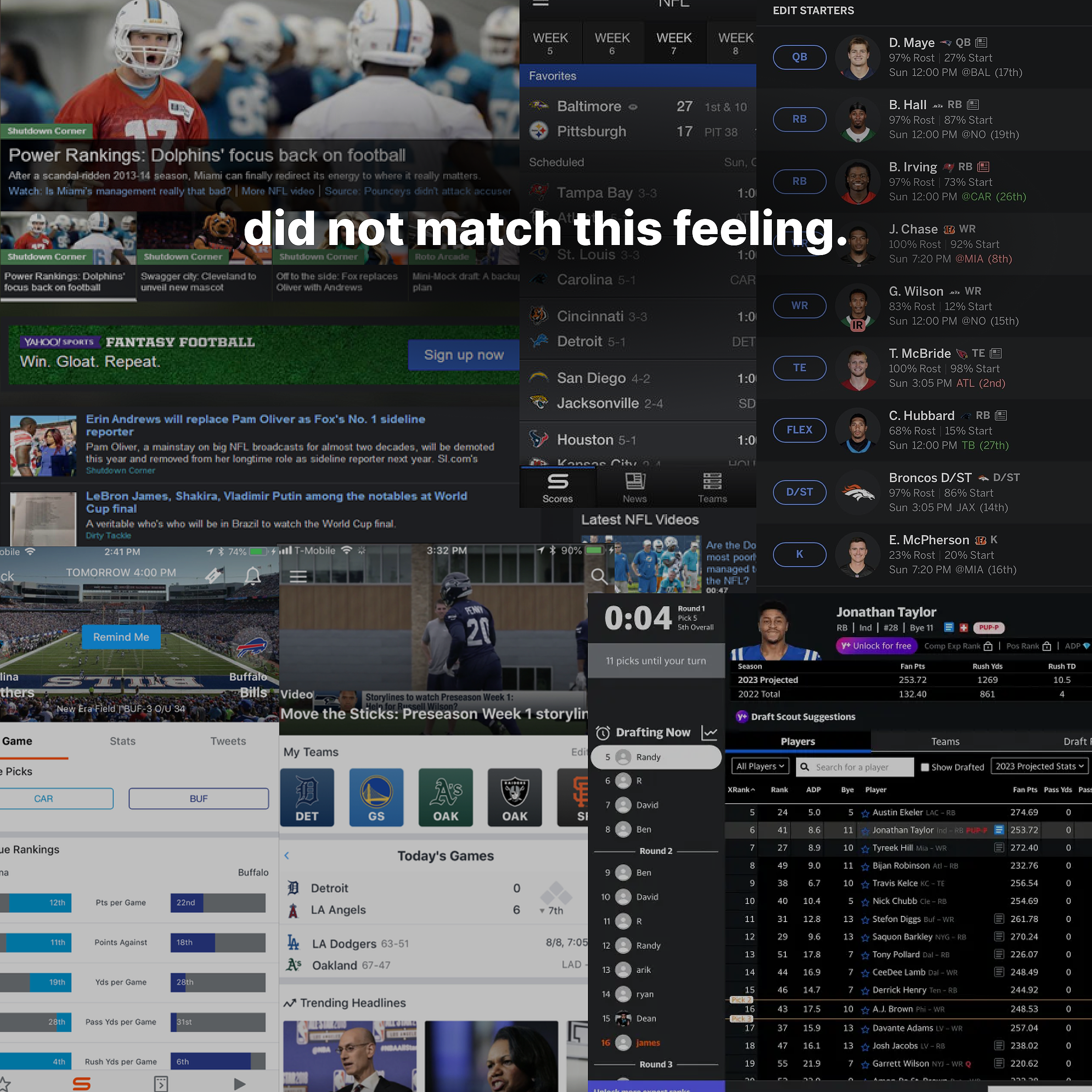
Fans showed up ready to lose their minds over a backup quarterback’s first touchdown—we handed them a user manual. Even with great content and the number one Fantasy app, the experience felt like doing your taxes during the Super Bowl. We set out to close that enthusiasm gap, rethinking interactions and visual design to better match the beautiful chaos of fandom.

Goal:
Bridge the enthusiasm gap.
🤪 →
A product can work perfectly and still say nothing. The best ones make us feel something we didn’t expect.
Product Insight
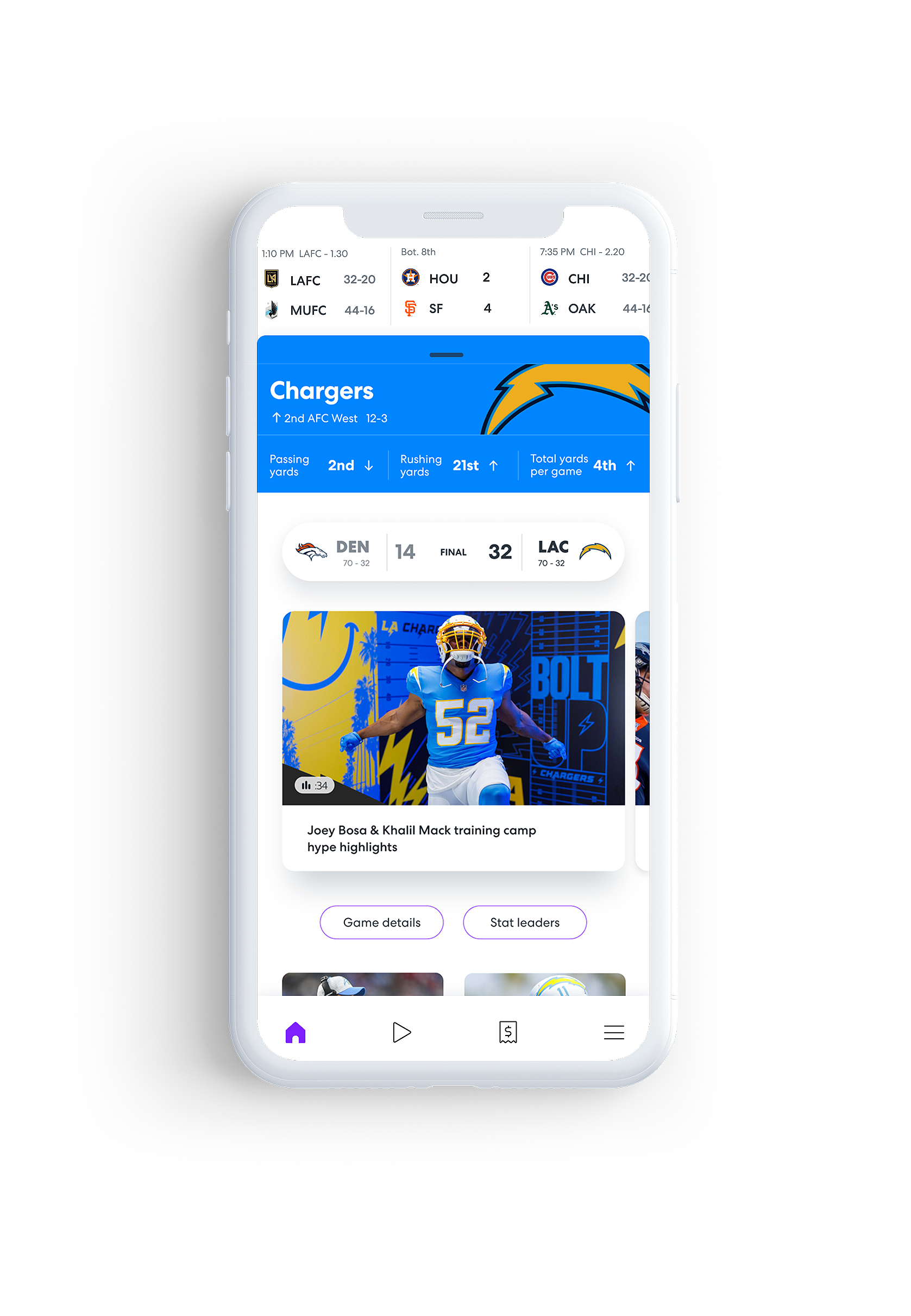
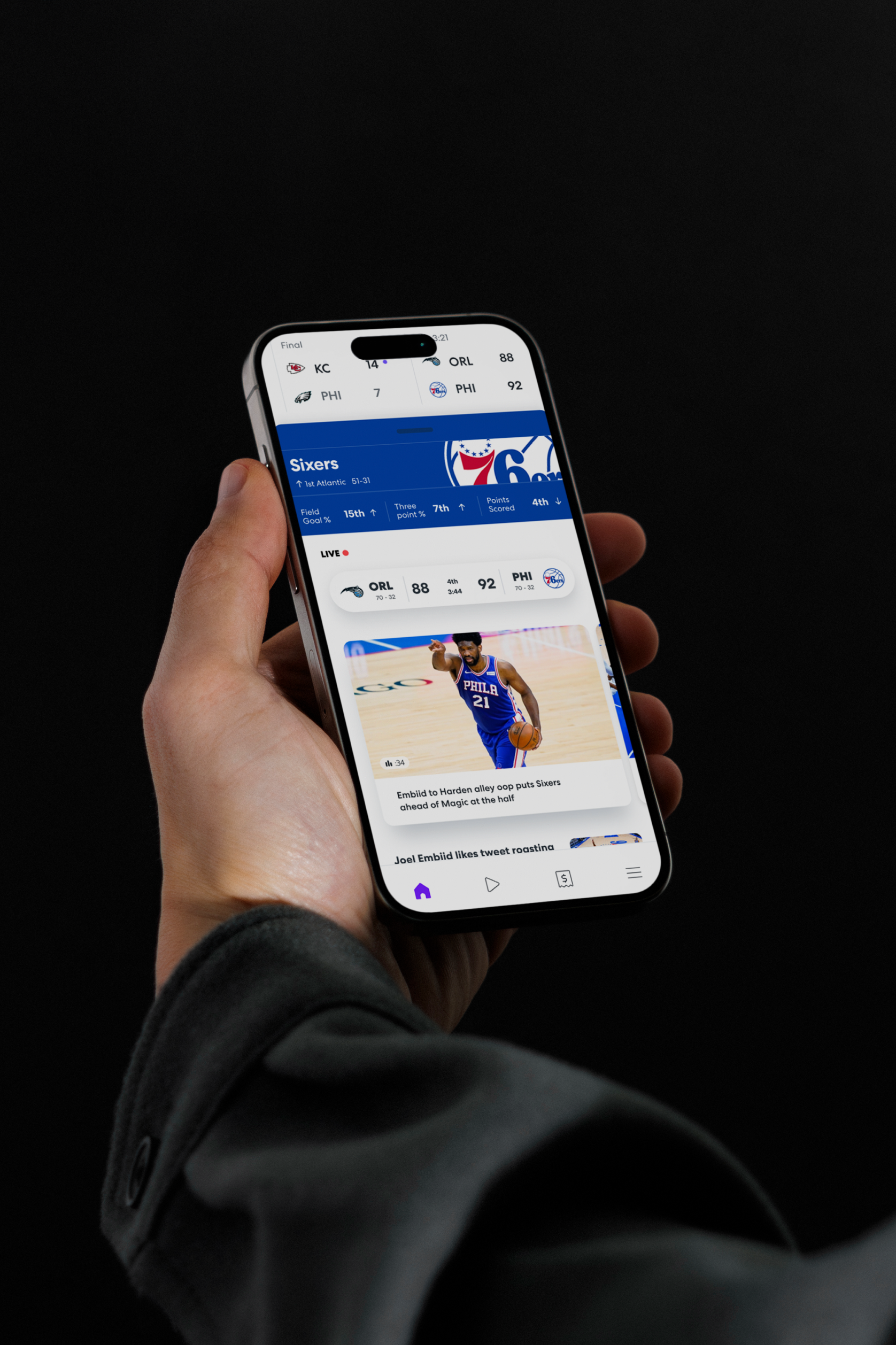
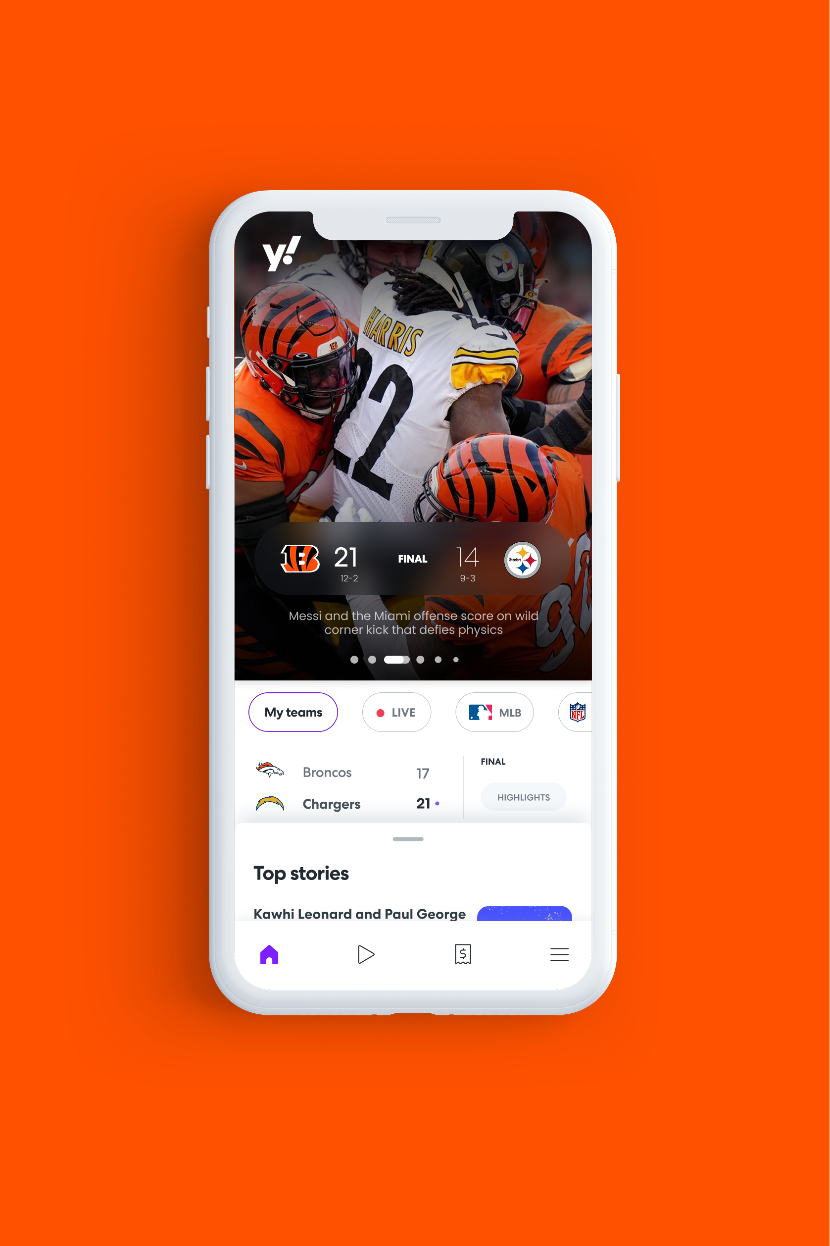
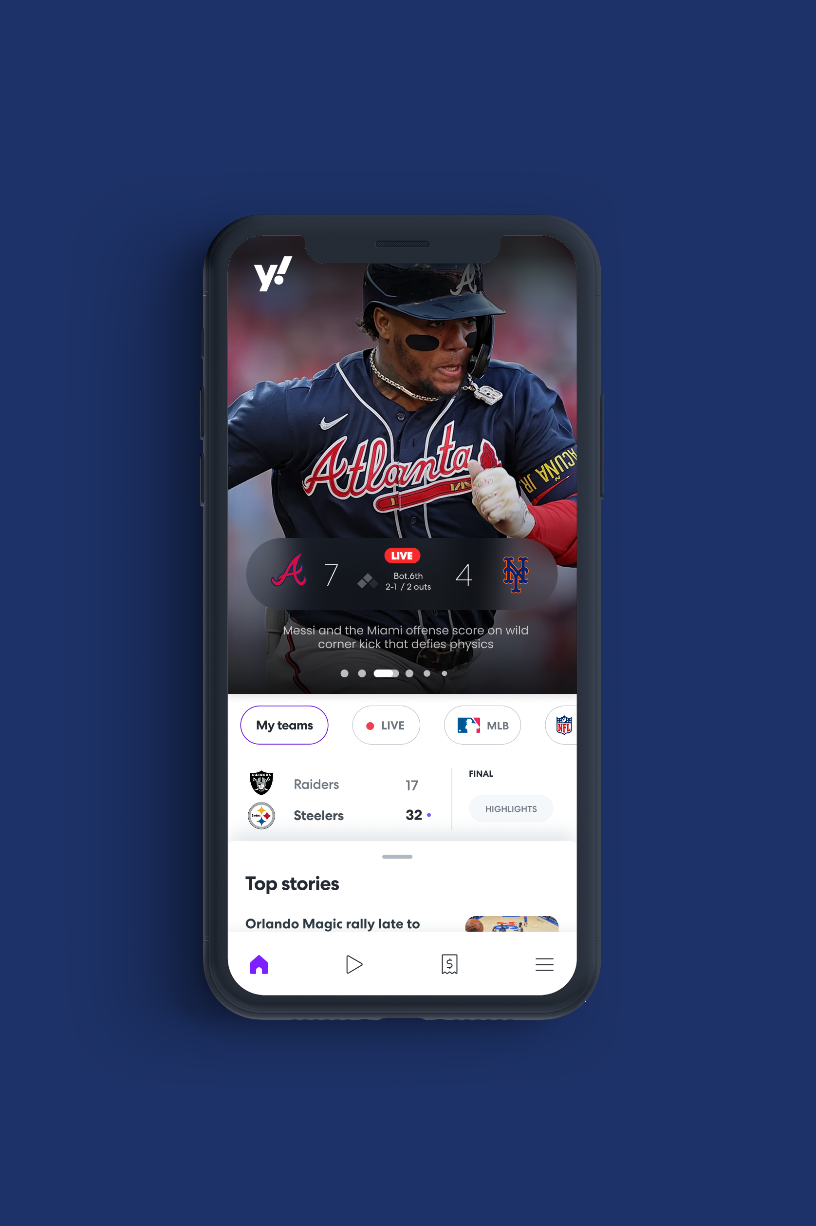
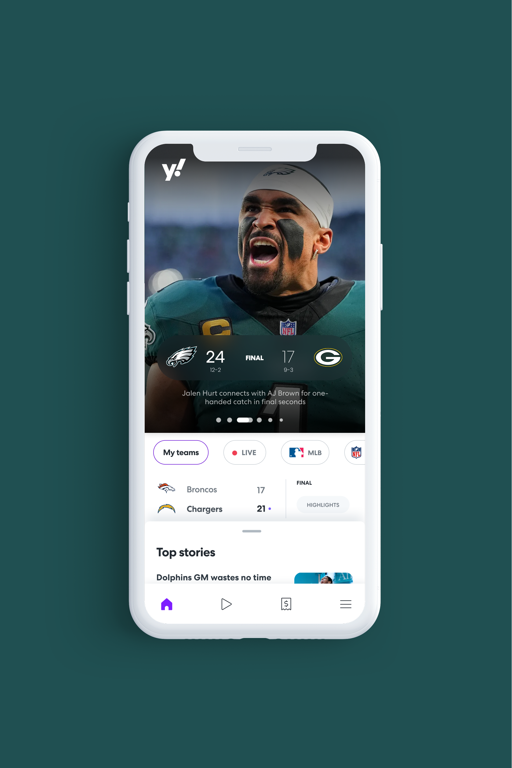
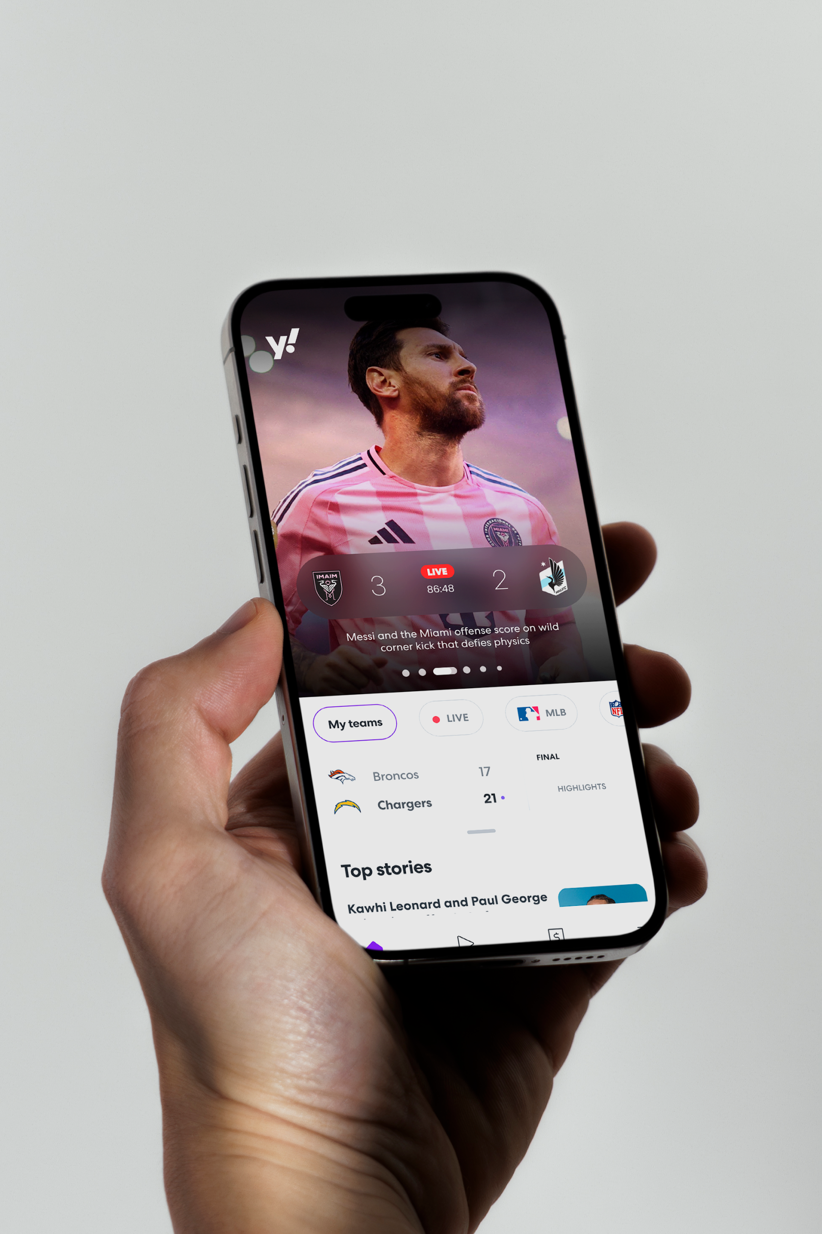
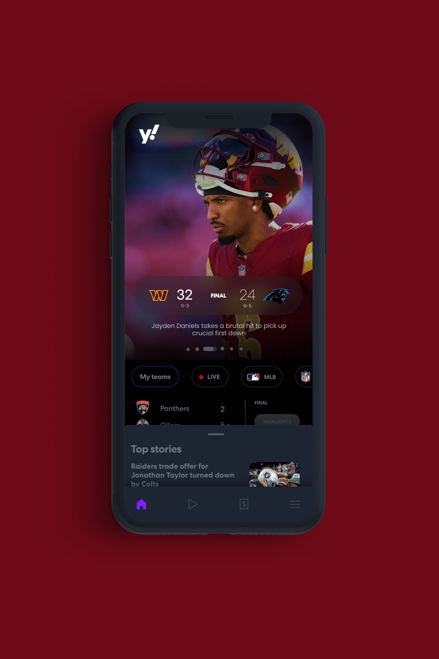
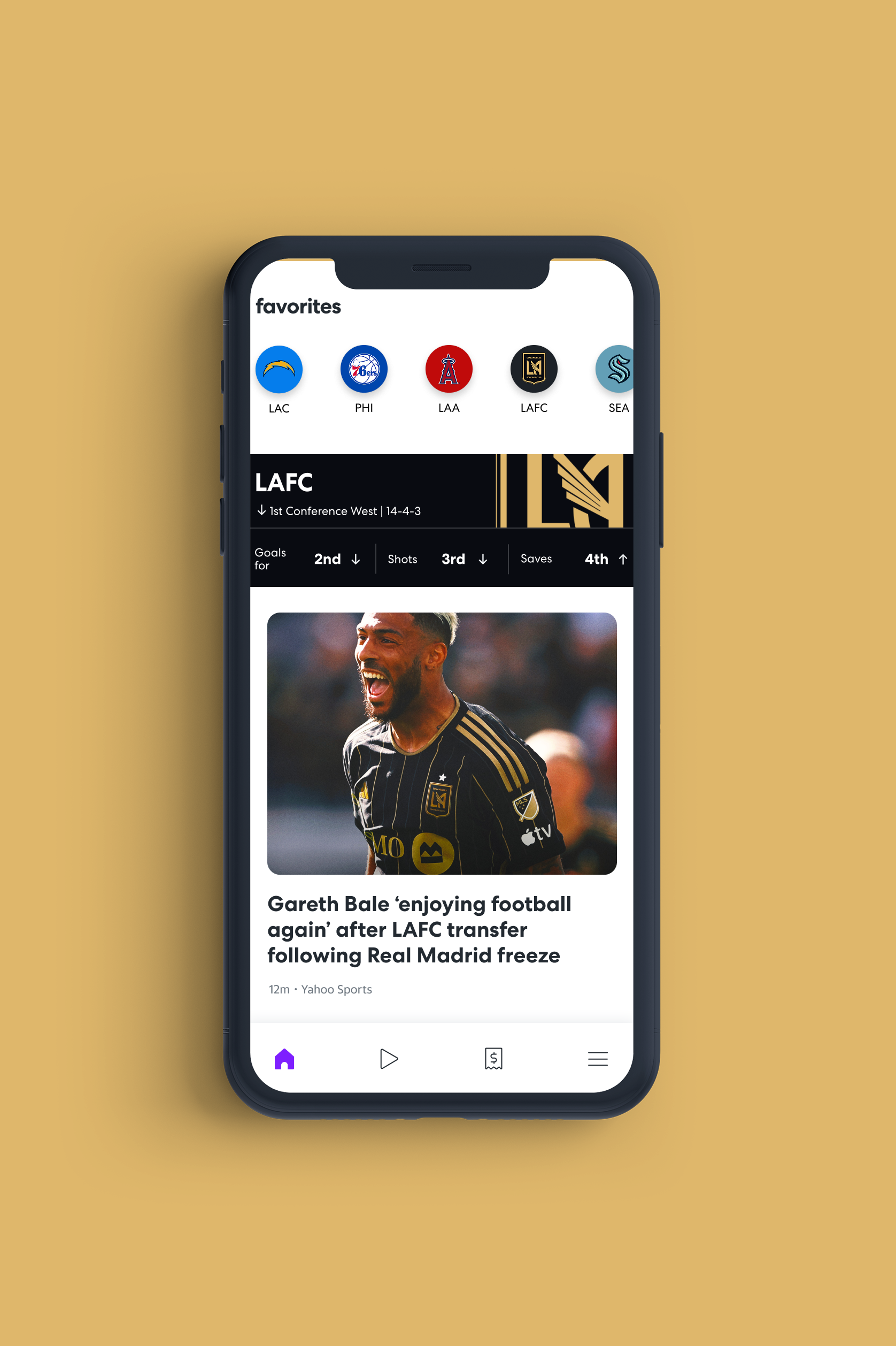
Let’s separate data from content to match how fans actually use the app.
We focused on a key disconnect: fans toggle between checking scores and reading news, yet the product blended both in ways that made each harder to find. We addressed this by separating data from content—designing scores and stats as a fast, always-accessible primary layer, with news in a persistent bottom sheet for deeper exploration. This shift reshaped the architecture, interactions, and visual system, making it easier for fans to move between scores and stories without losing their place.
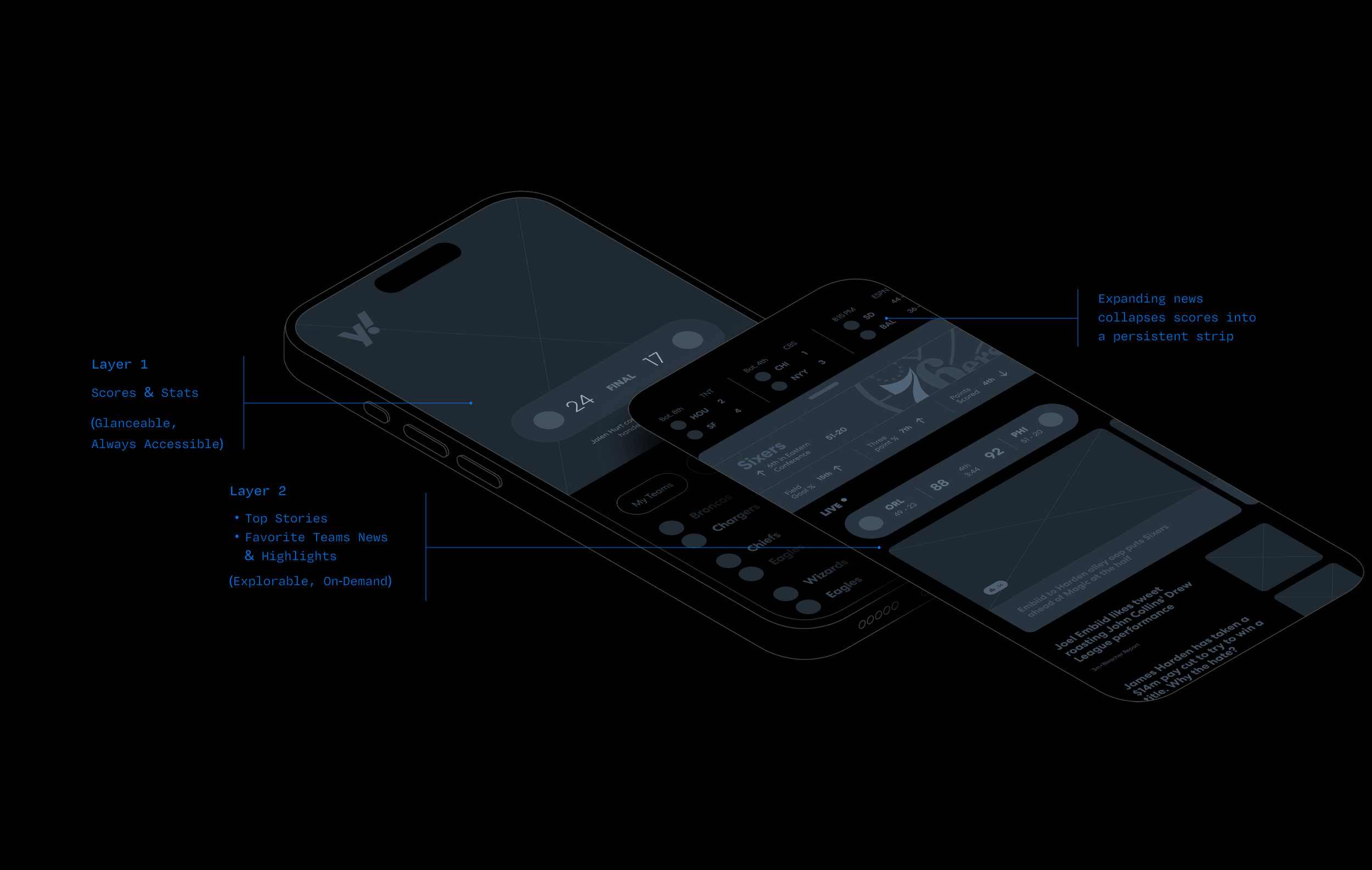
From this
Scores: minimal space, one at a time, not personalized
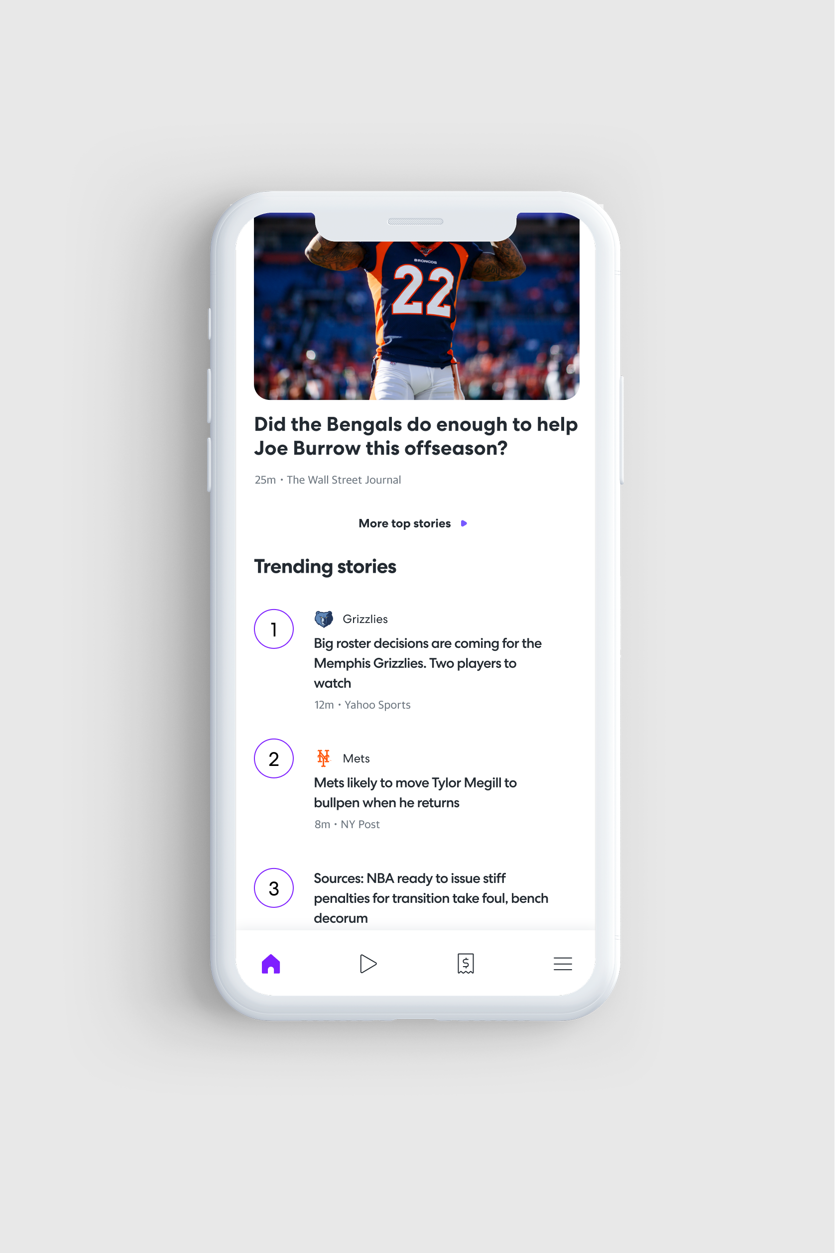
Your team news drowned out by generic headlines
Visual energy nowhere near fan energy

To this
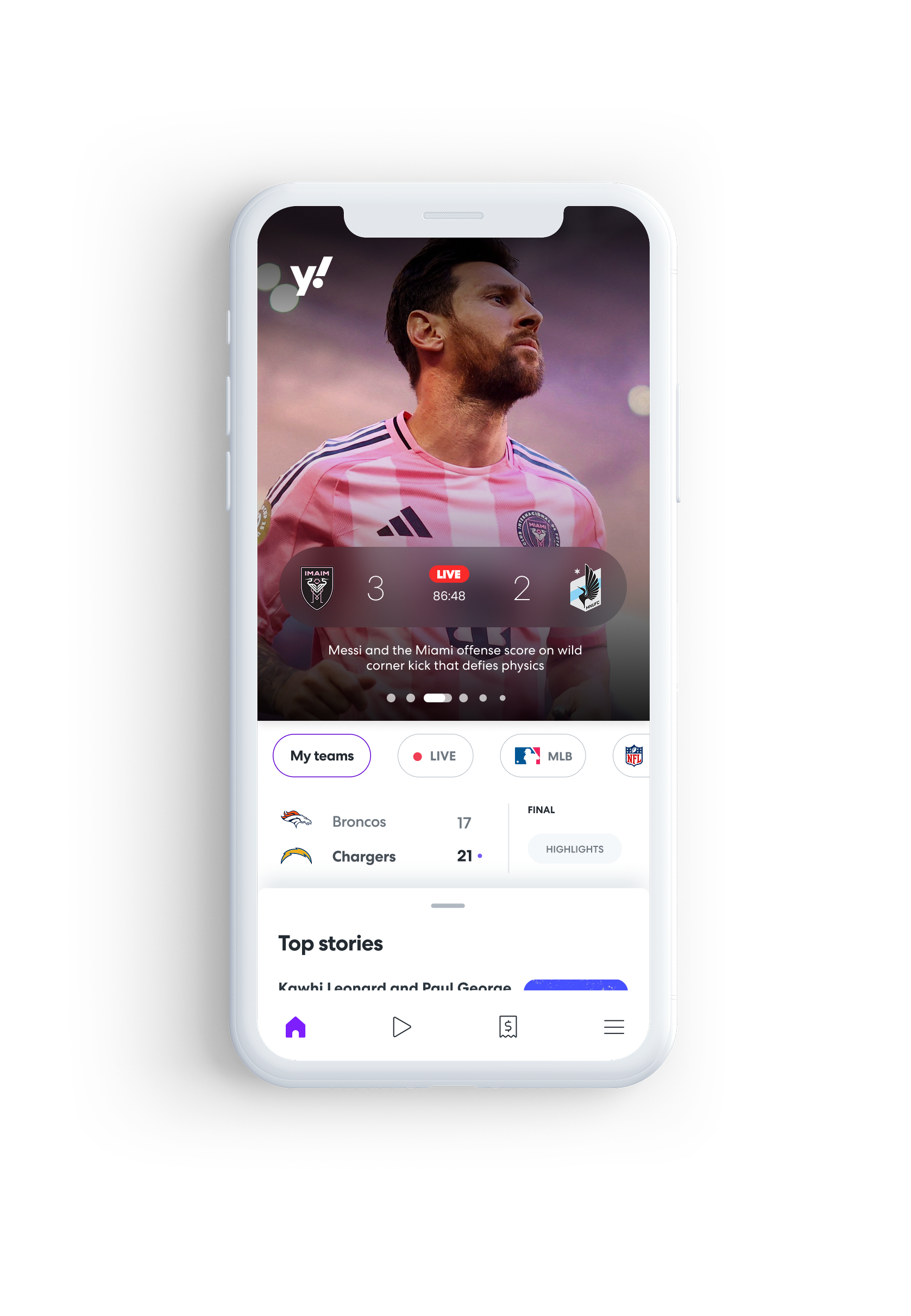
Scores: front and center, multiple games, personalized to your favorite teams & leagues
Your team news prioritized with depth and highlights
Visual energy matches fan energy
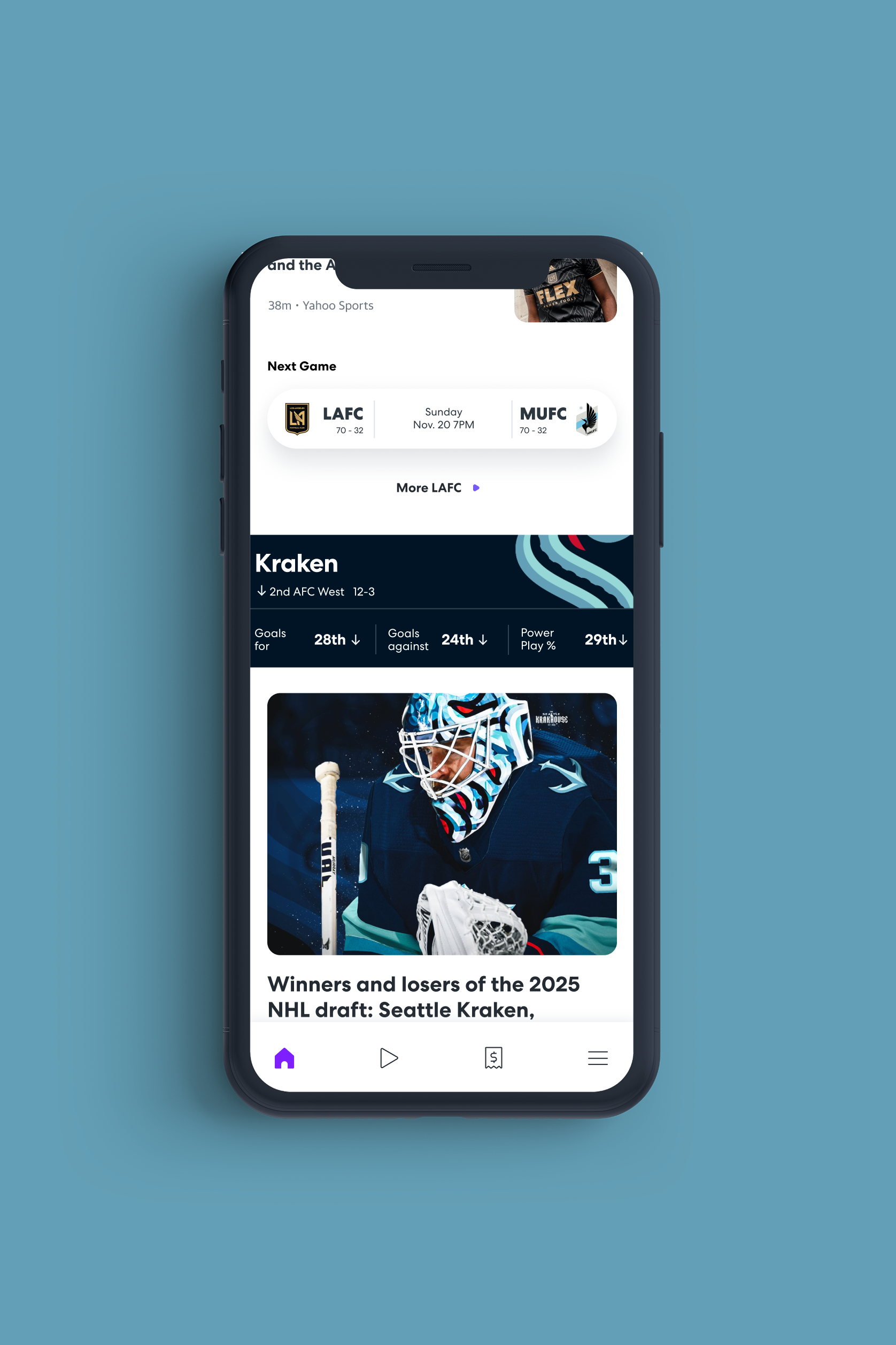
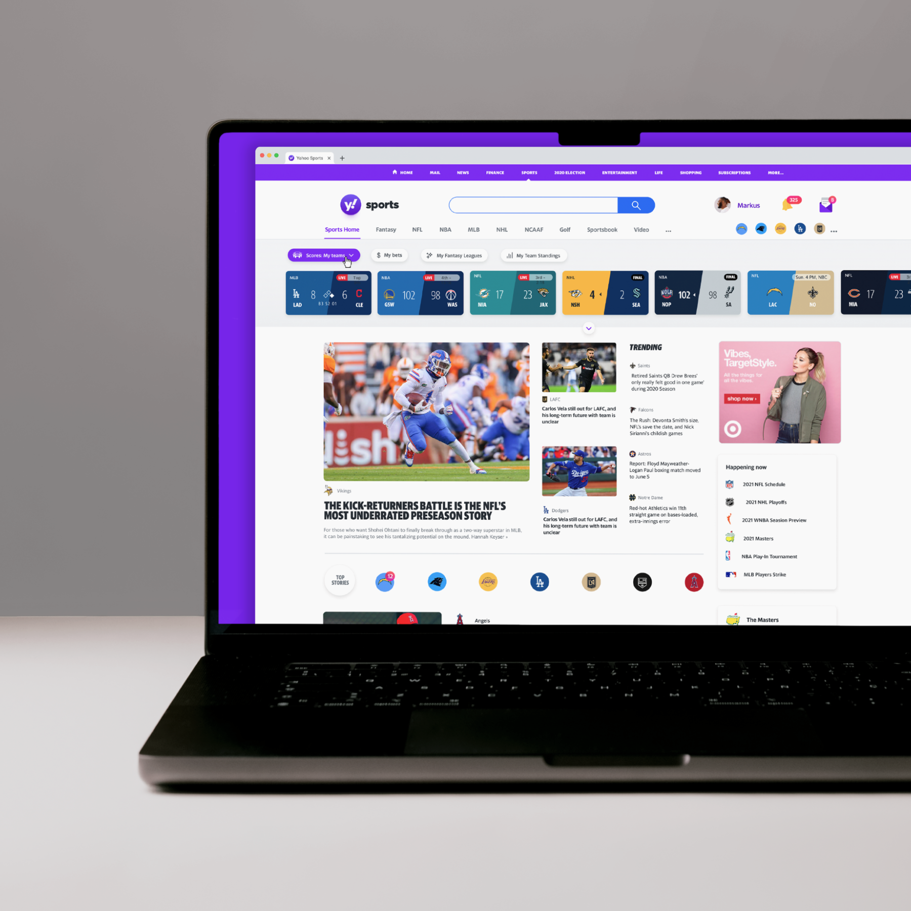
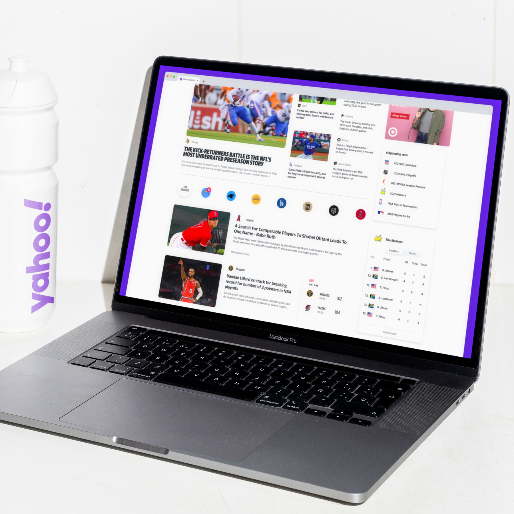
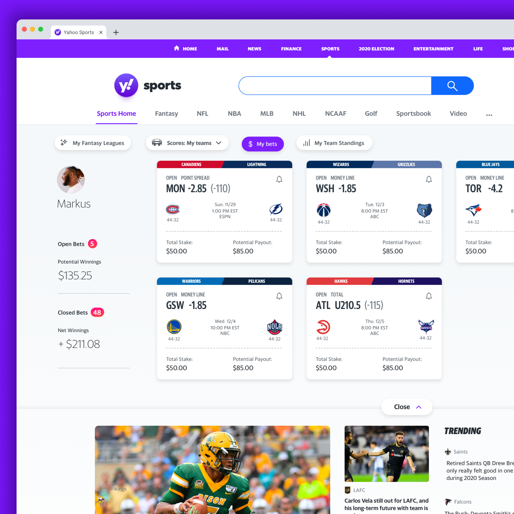
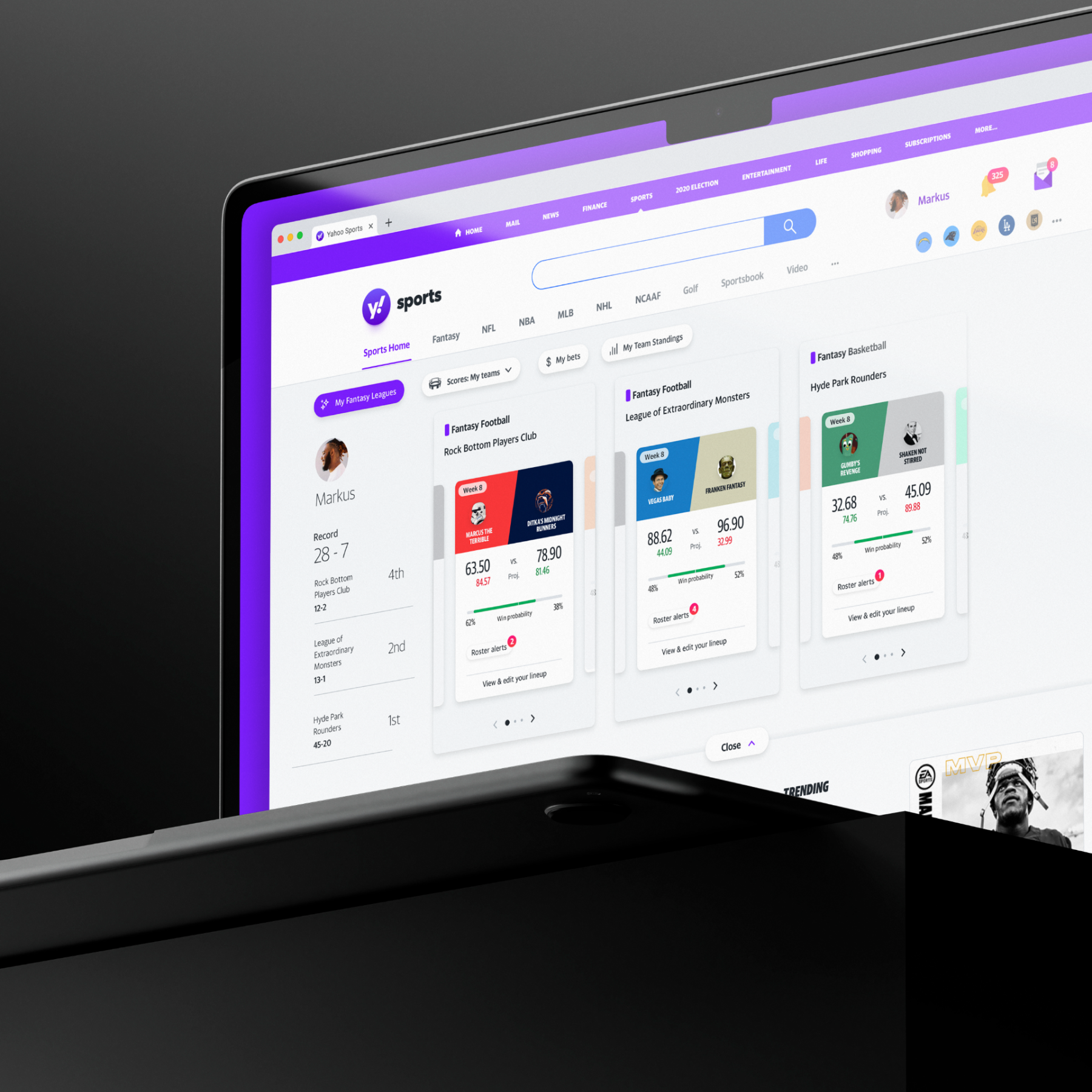
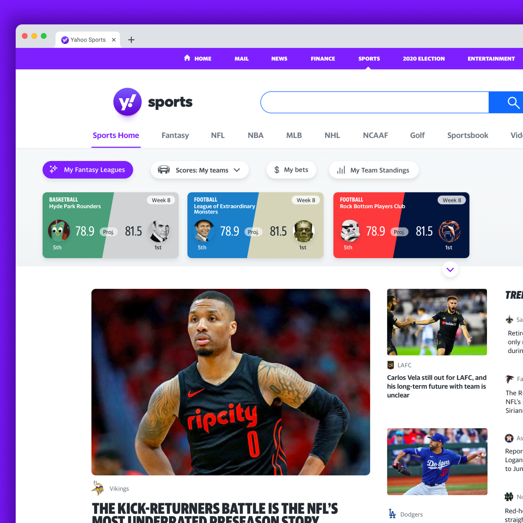
Desktop
On desktop, we focused on supporting the way fans juggle multiple obsessions at once. Betting, fantasy, and scores often live on separate pages, forcing fans to bounce around and lose context. We brought those behaviors together into a single command center, surfacing high-level information immediately with deeper detail revealed through simple, downward expansion. The result is an experience that lets fans track tough losses, miracle wins, and fantasy lineup disasters without losing their place—or their sanity—in the chaos.