Yahoo Design System
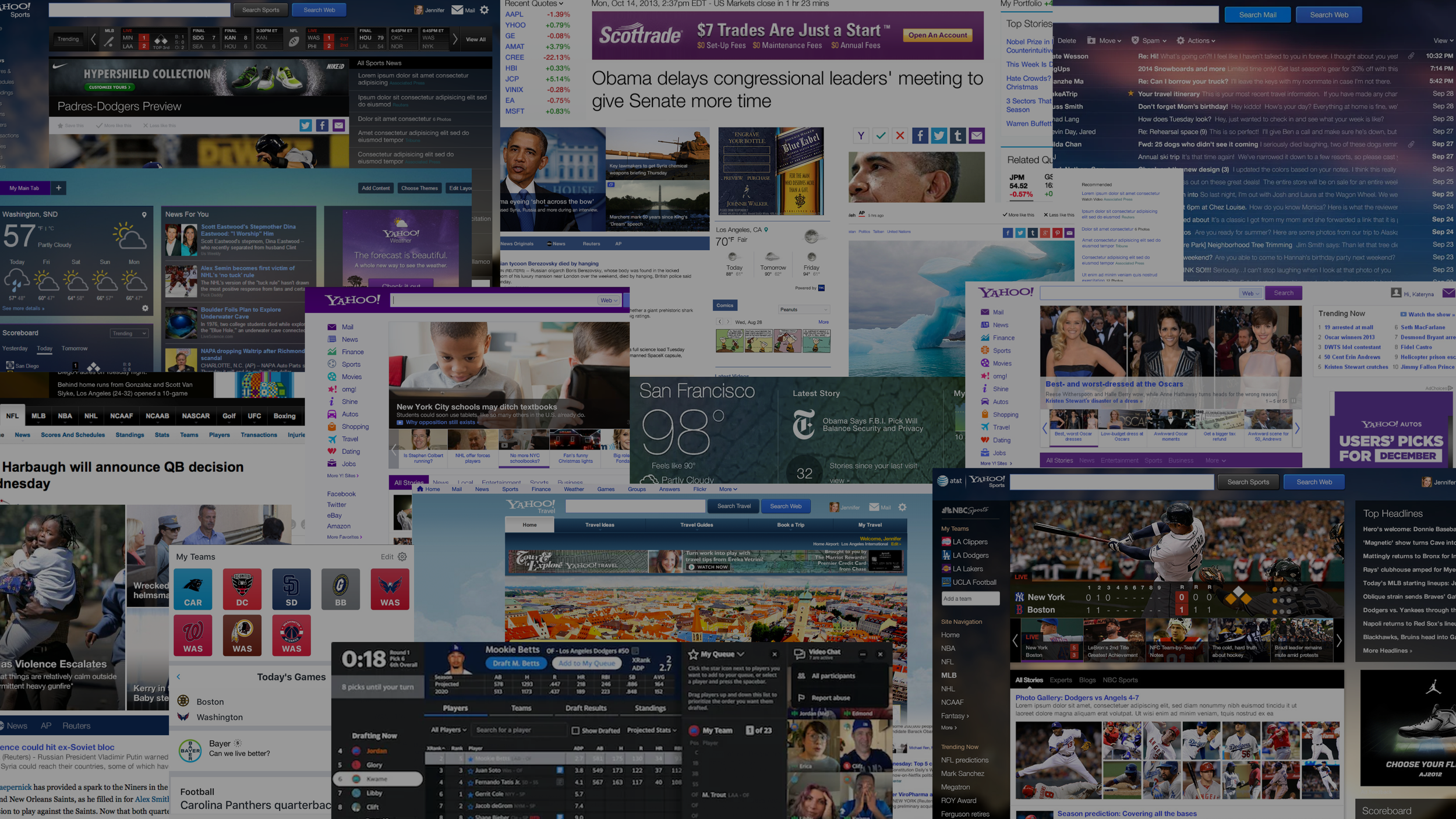
After 20 years as one of the internet’s most iconic brands, Yahoo had drifted into a set of products that no longer felt fully connected. Consistency and efficiency mattered, but they weren’t enough. The bigger opportunity was a system that could bring the products back together while still giving each one room to develop its own voice.
The goal was unity, not uniformity.
Fixing a fractured brand
Over time, Yahoo's products evolved independently, each developing its own structure, behaviors, and personality. That diversity was a strength, not a flaw. The challenge wasn't to erase those differences, but to create a shared foundation that allowed every product to feel distinct while remaining unmistakably Yahoo.
Great systems don't eliminate variation. They decide where it belongs.
Harmony over consistency
Healthy ecosystems thrive on difference—product ecosystems are no different. Consistency is the easier argument; harmony is the harder ambition because it asks differences to strengthen one another. The goal was never more rules. It was more room.
One component, multiple expressions. Each product finds its own rhythm and personality. This is where the product becomes a brand.
Flexible
The arrangement
typography families & styles / section layouts / spacing / color use & emphasis / iIllustration styles
Fixed
Shared foundations users never have to relearn, and teams shouldn't have to debate. When this is right, nobody notices. That's the point.
The score
Free
Good ideas shouldn't need the system's permission to exist. This is the place preserved for dissent.
The improvisation
emerging patterns / unproven ideas / exceptions / opportunities not yet accounted for by the system
grid / icons / buttons / color / cards / rows / navigation models / interaction patterns / design principles / well-established user mental models
The goal was never more rules. It was more room.
Typography is voice
Nothing in the product is seen more than type. Not the logo. Not the colors. Type.
Layout is rhythm
Layout is felt before it's read. The same grid can feel dense or spacious, urgent or calm, editorial or utilitarian.
Different audiences, stories, and moments call for different rhythms.
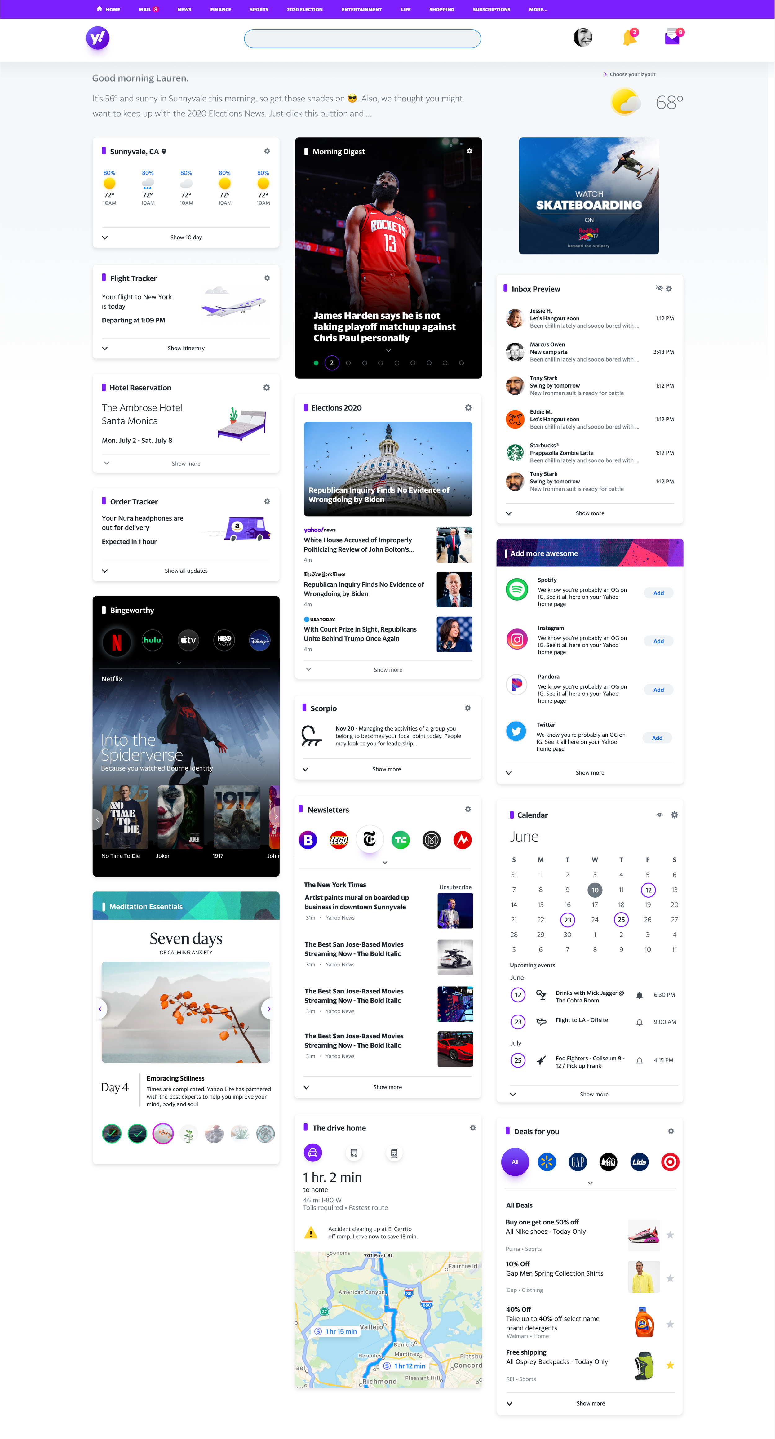
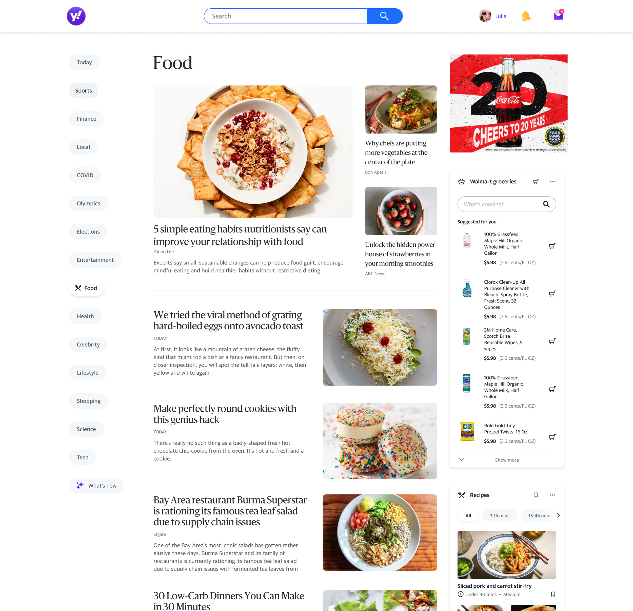
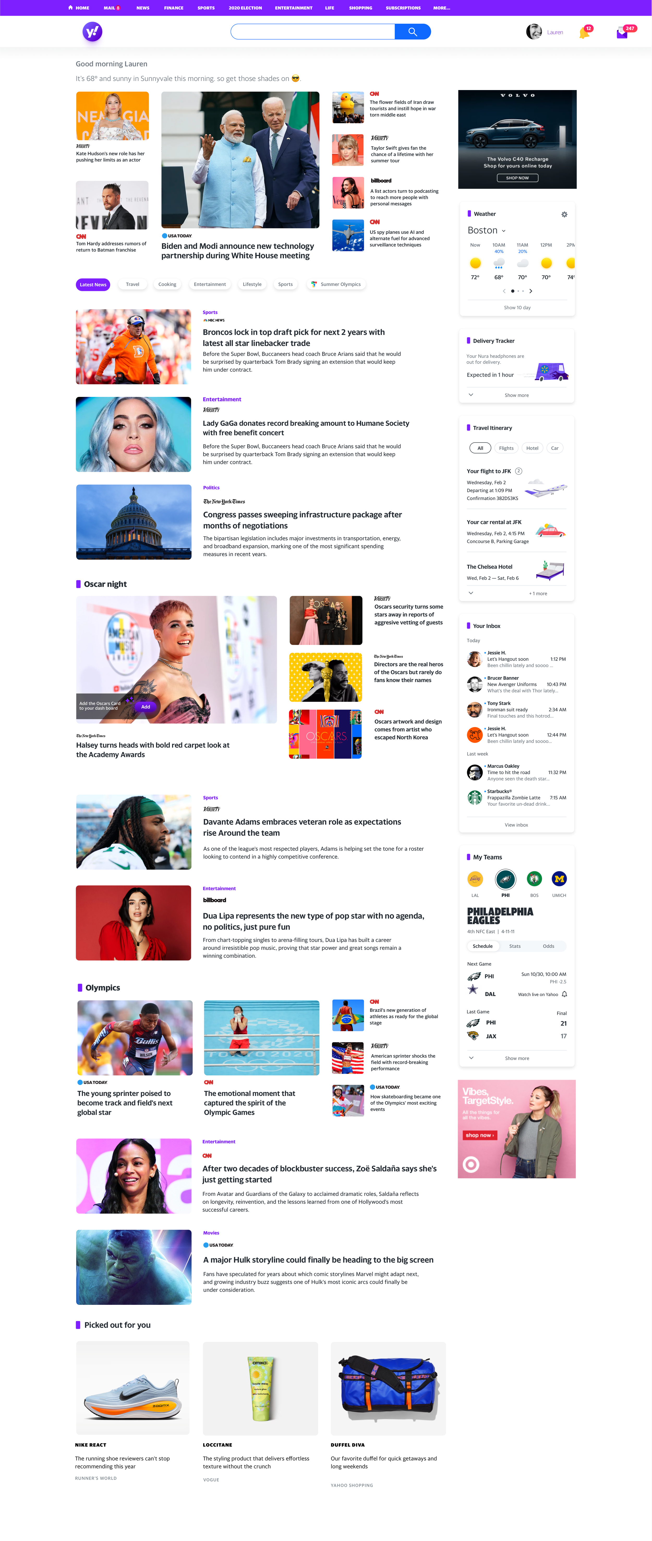
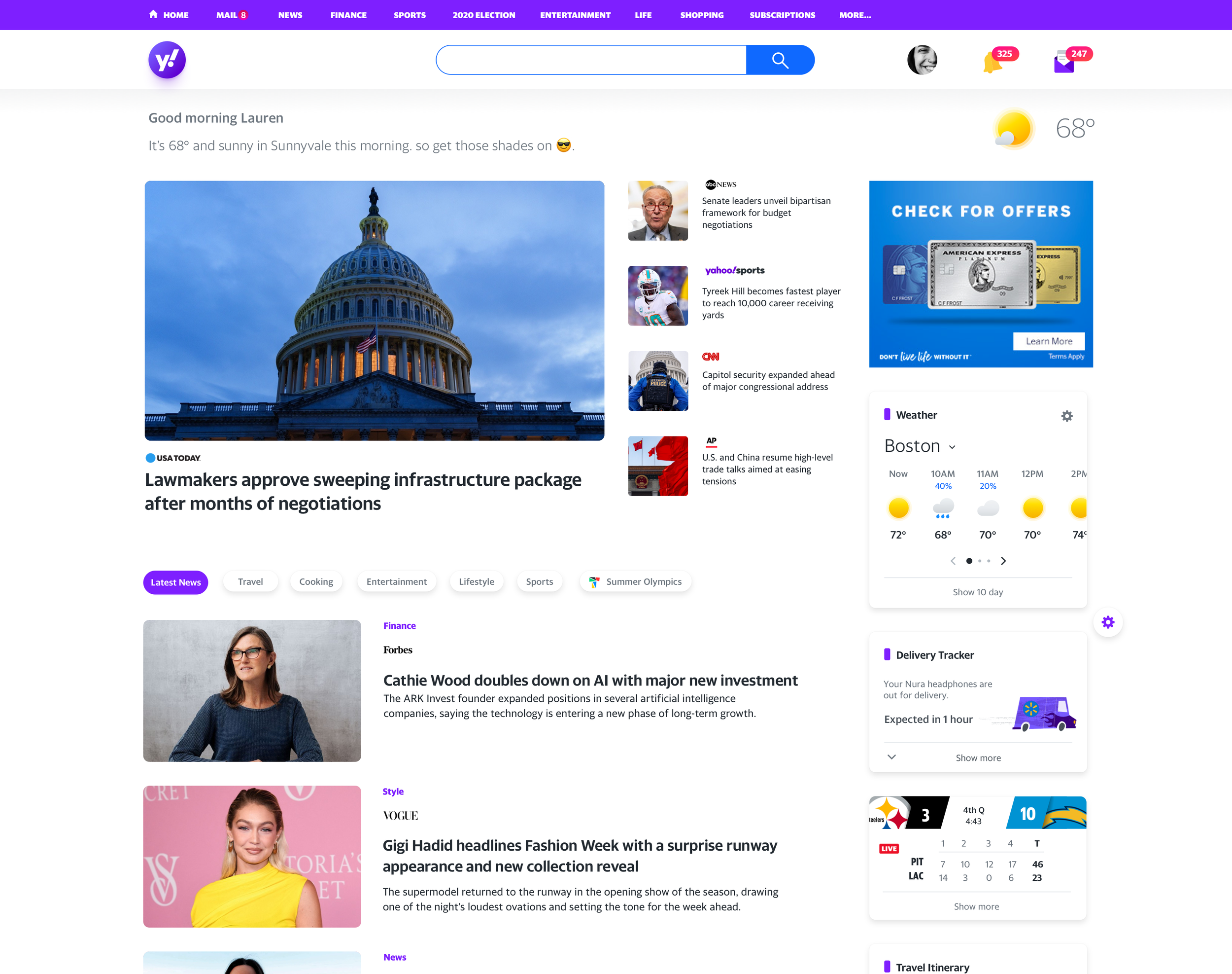
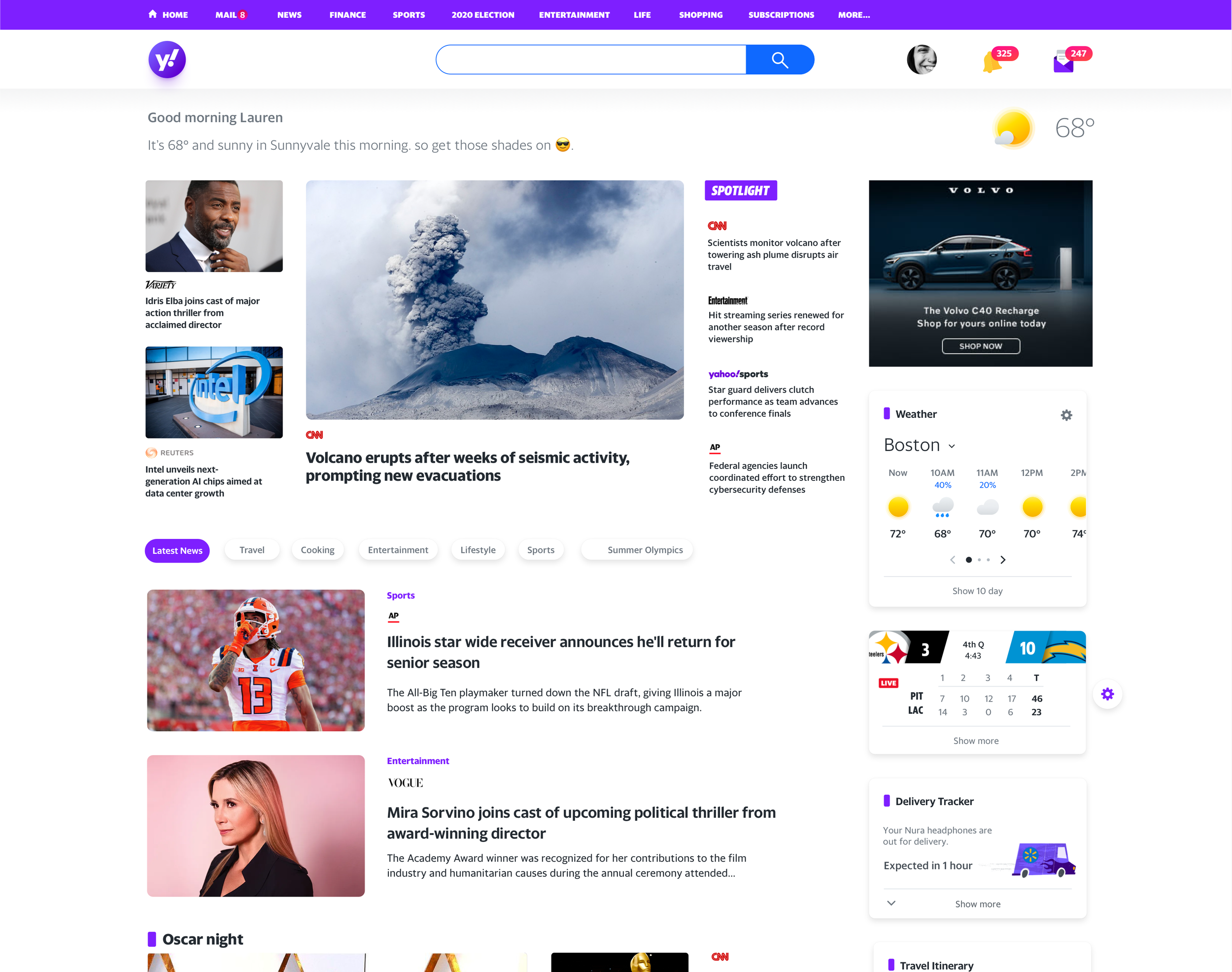
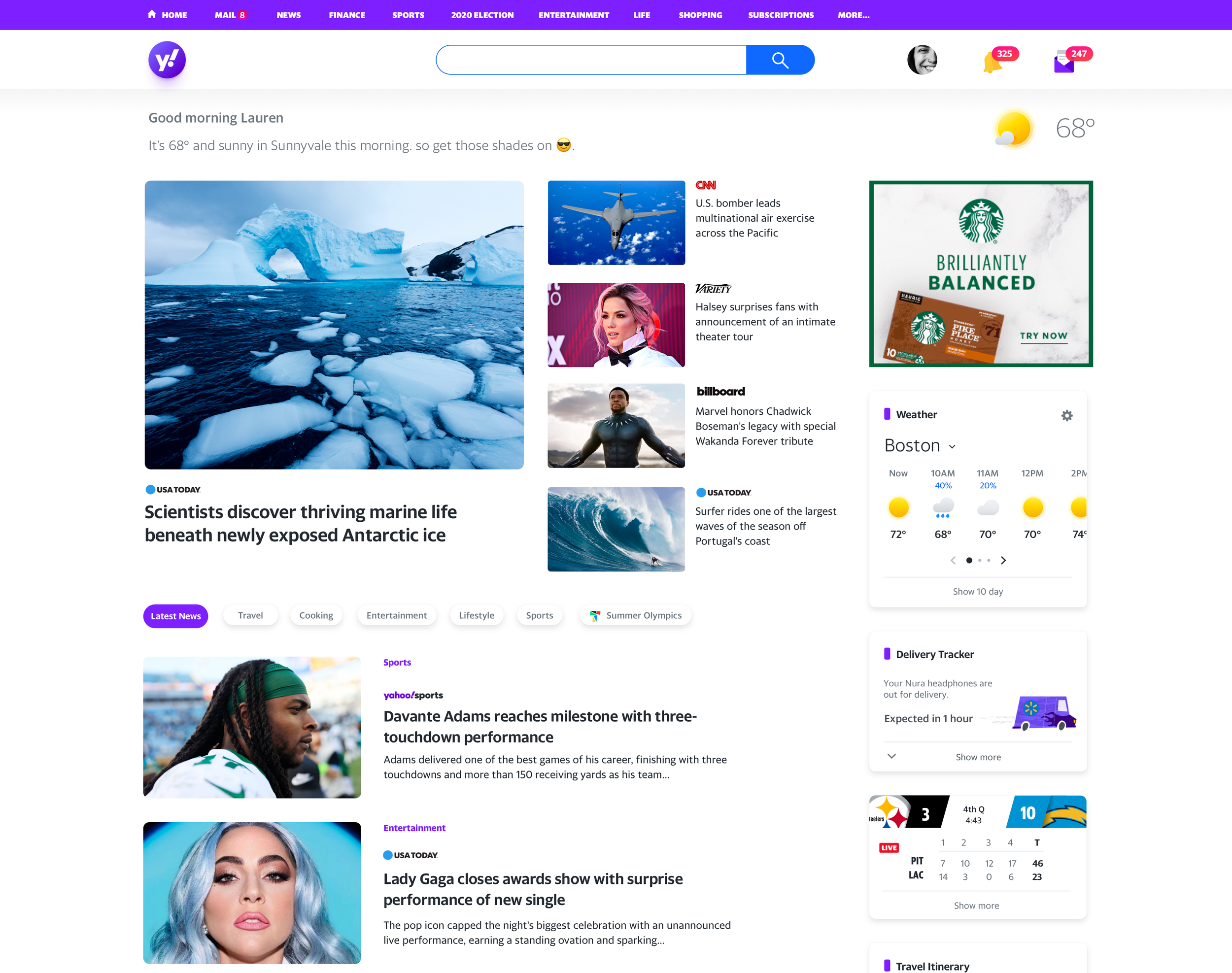
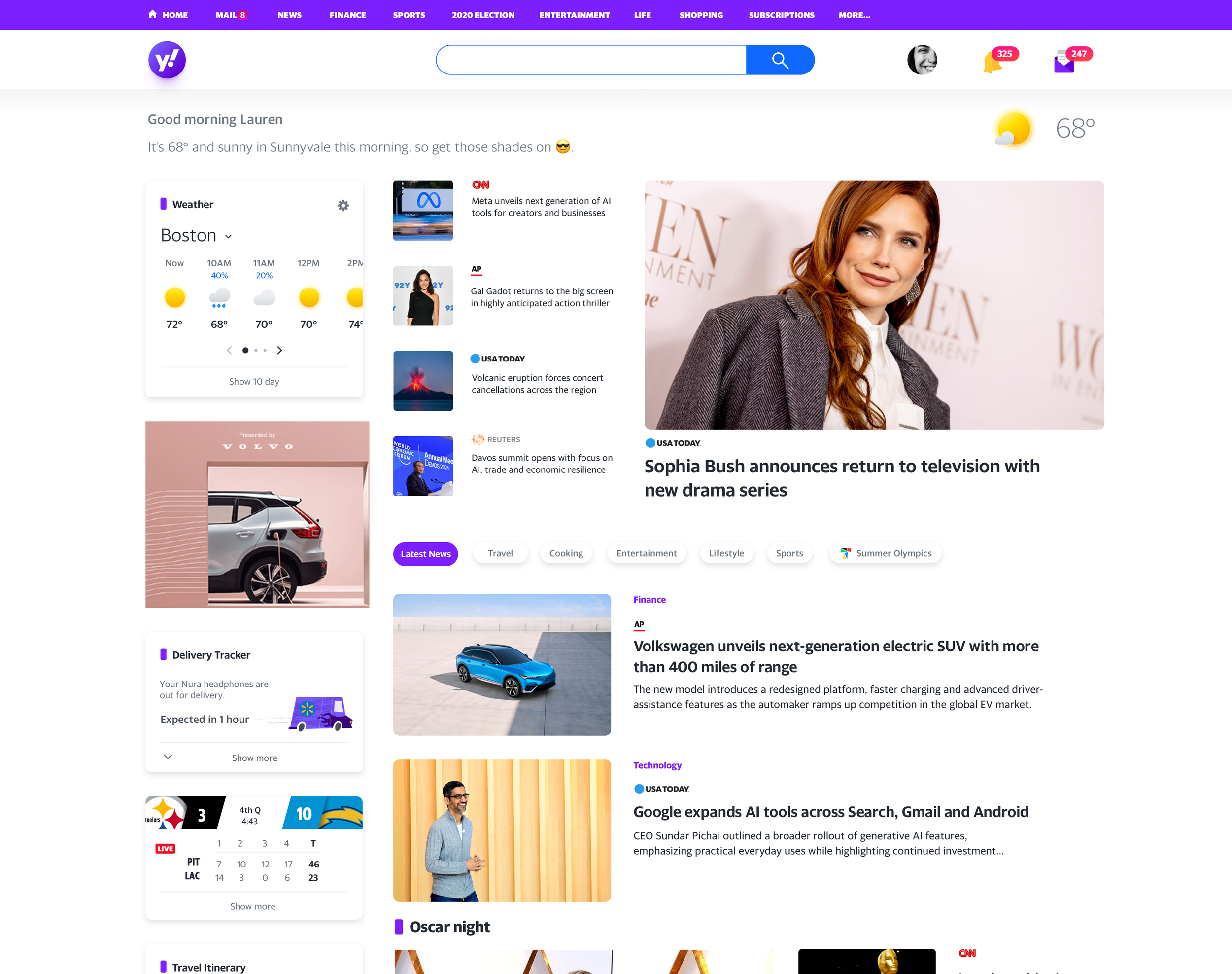
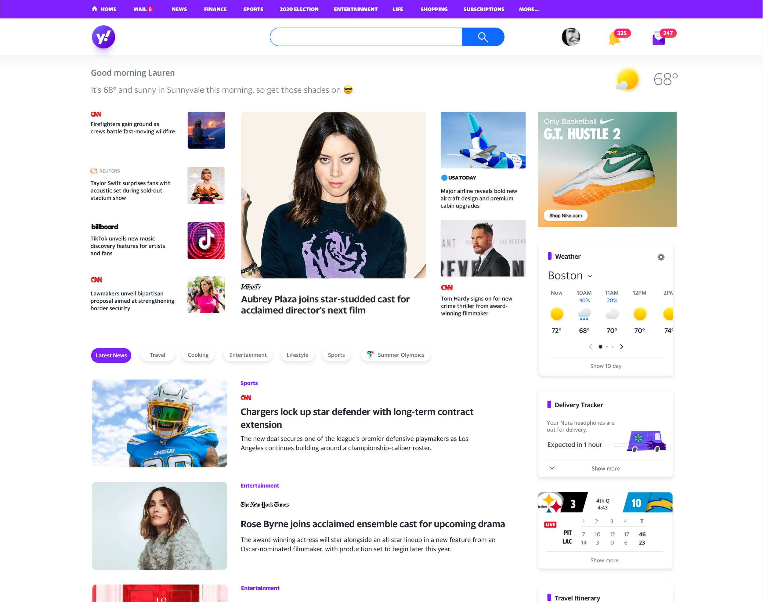
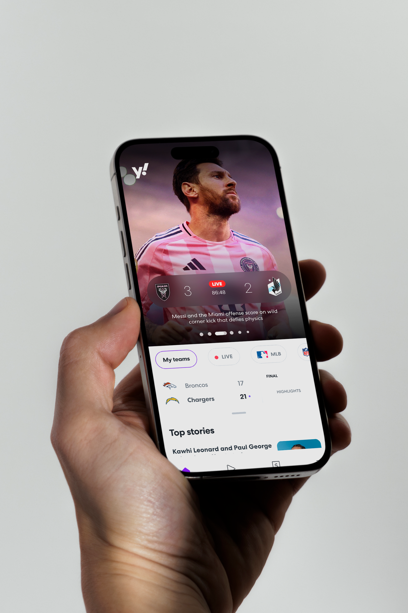
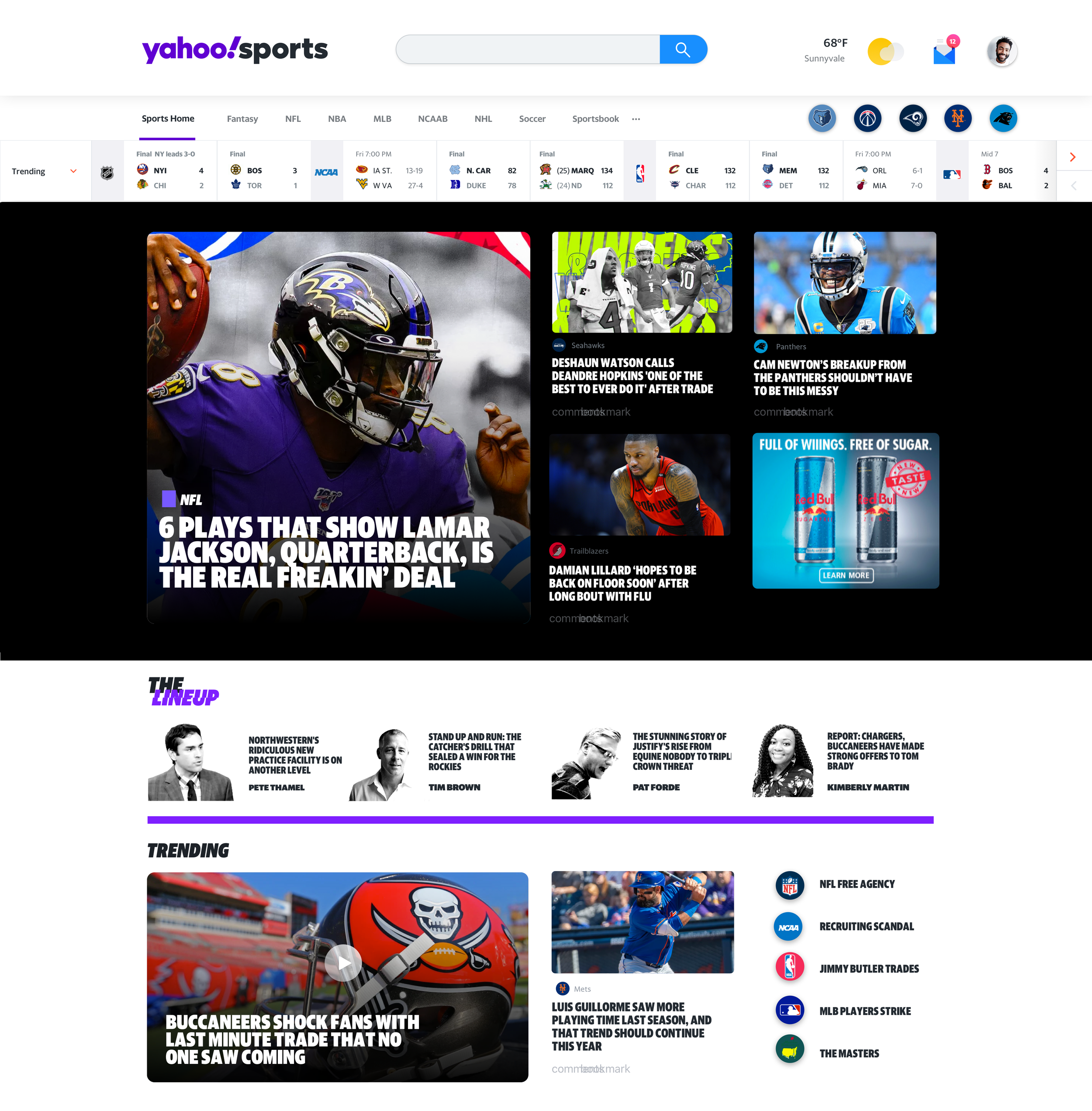
Homepage
As one of the most visited pages on the internet, the Yahoo homepage demanded more than a single layout. I designed it as a publishing framework built around the balance of content, utility, and editorial expression. Every decision was about earning attention, not just on arrival but over time. More reasons to stay. More reasons to come back.
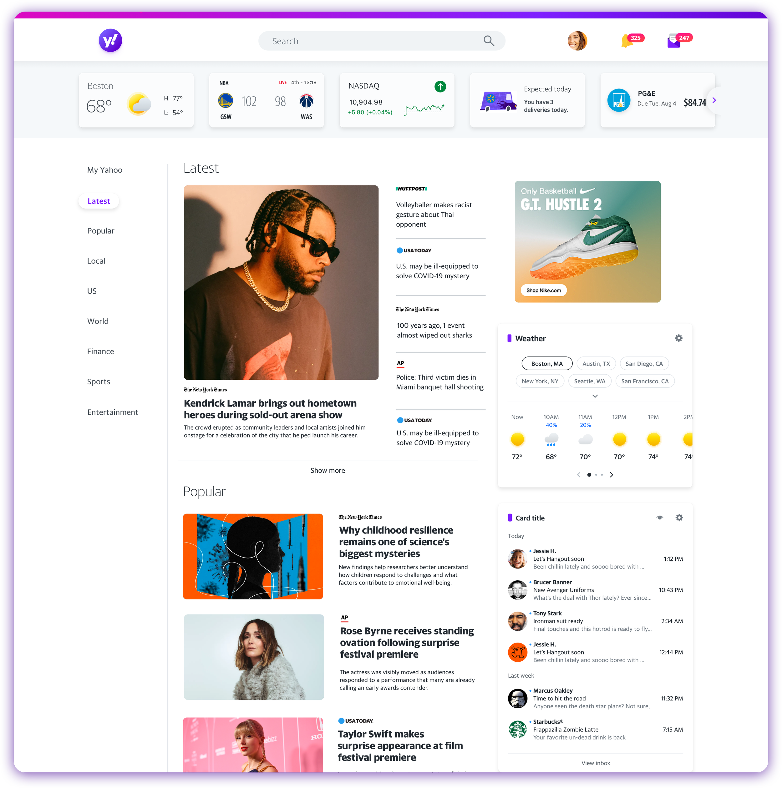

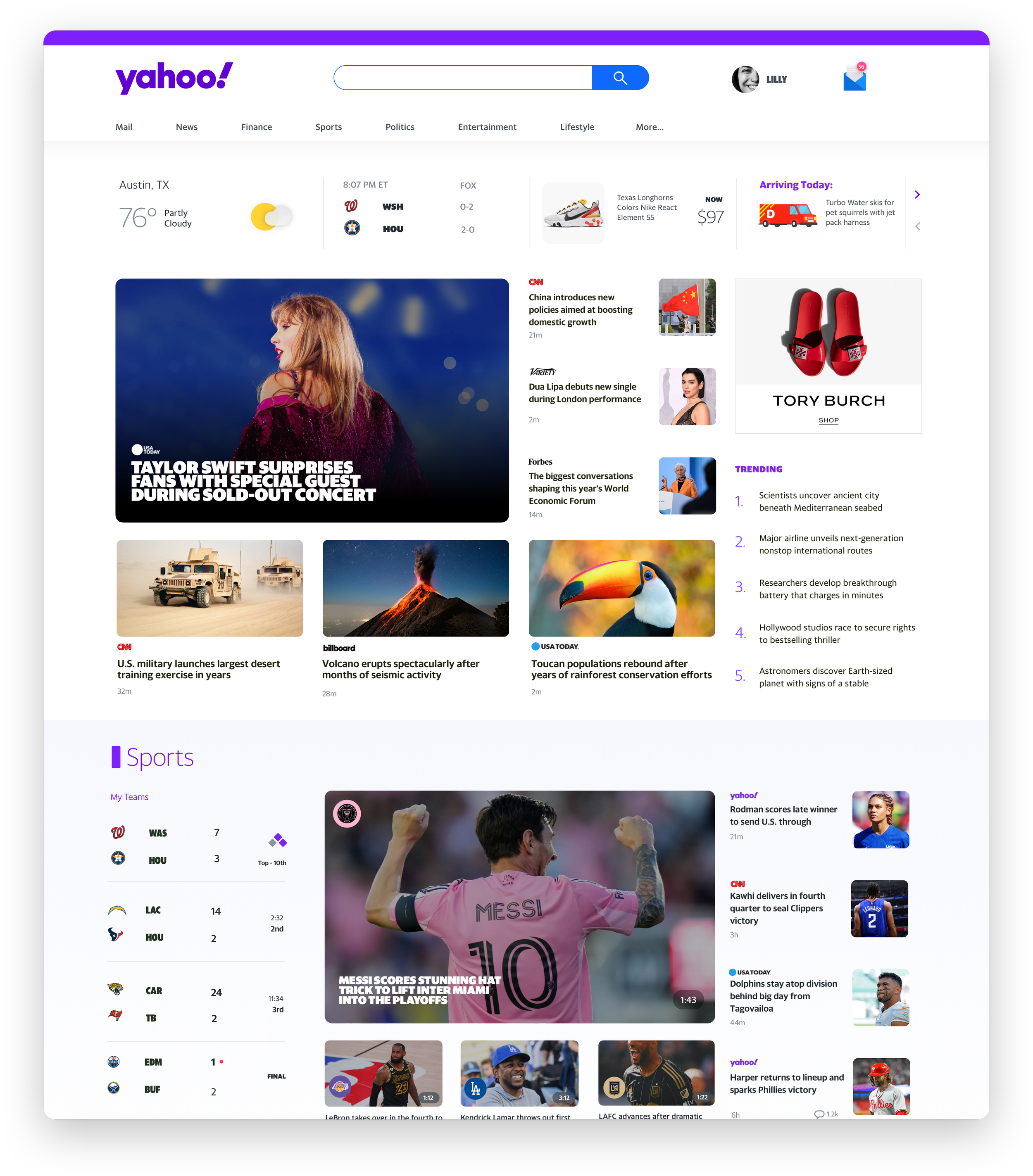

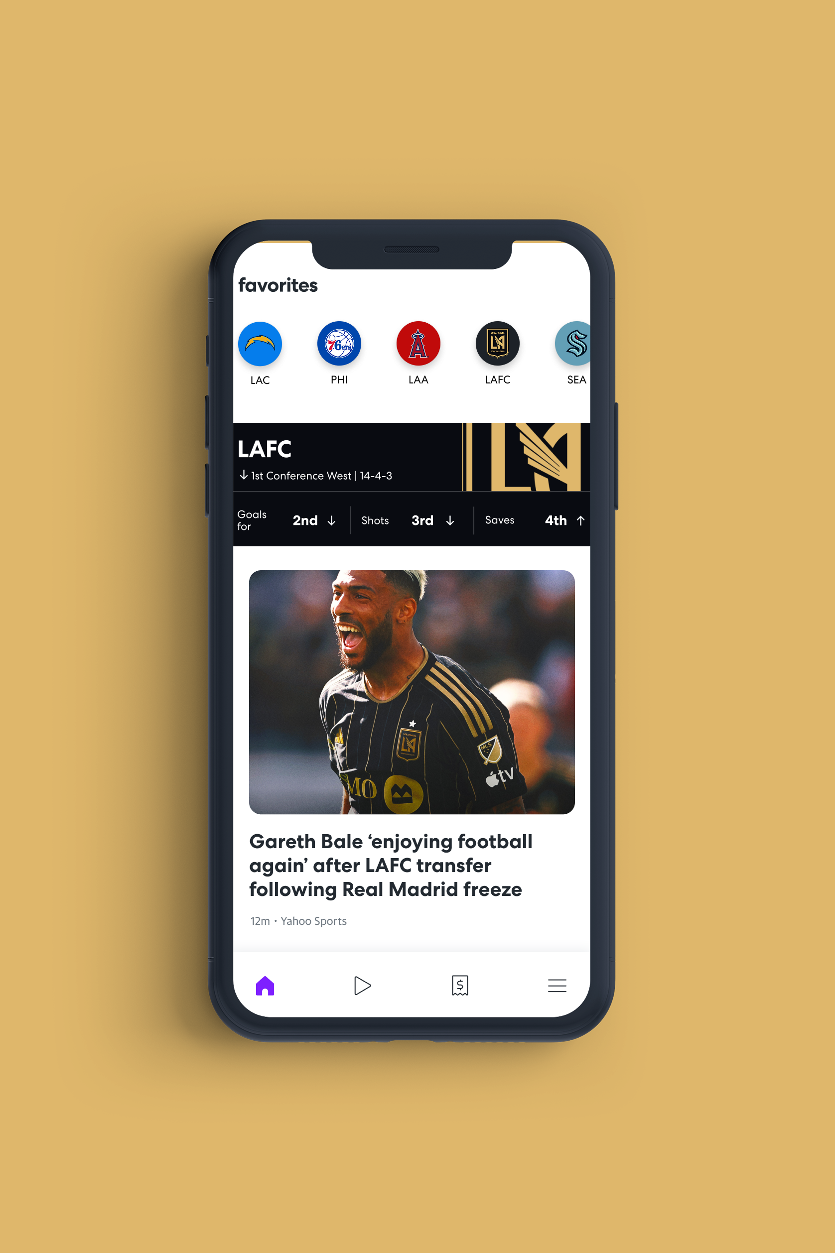
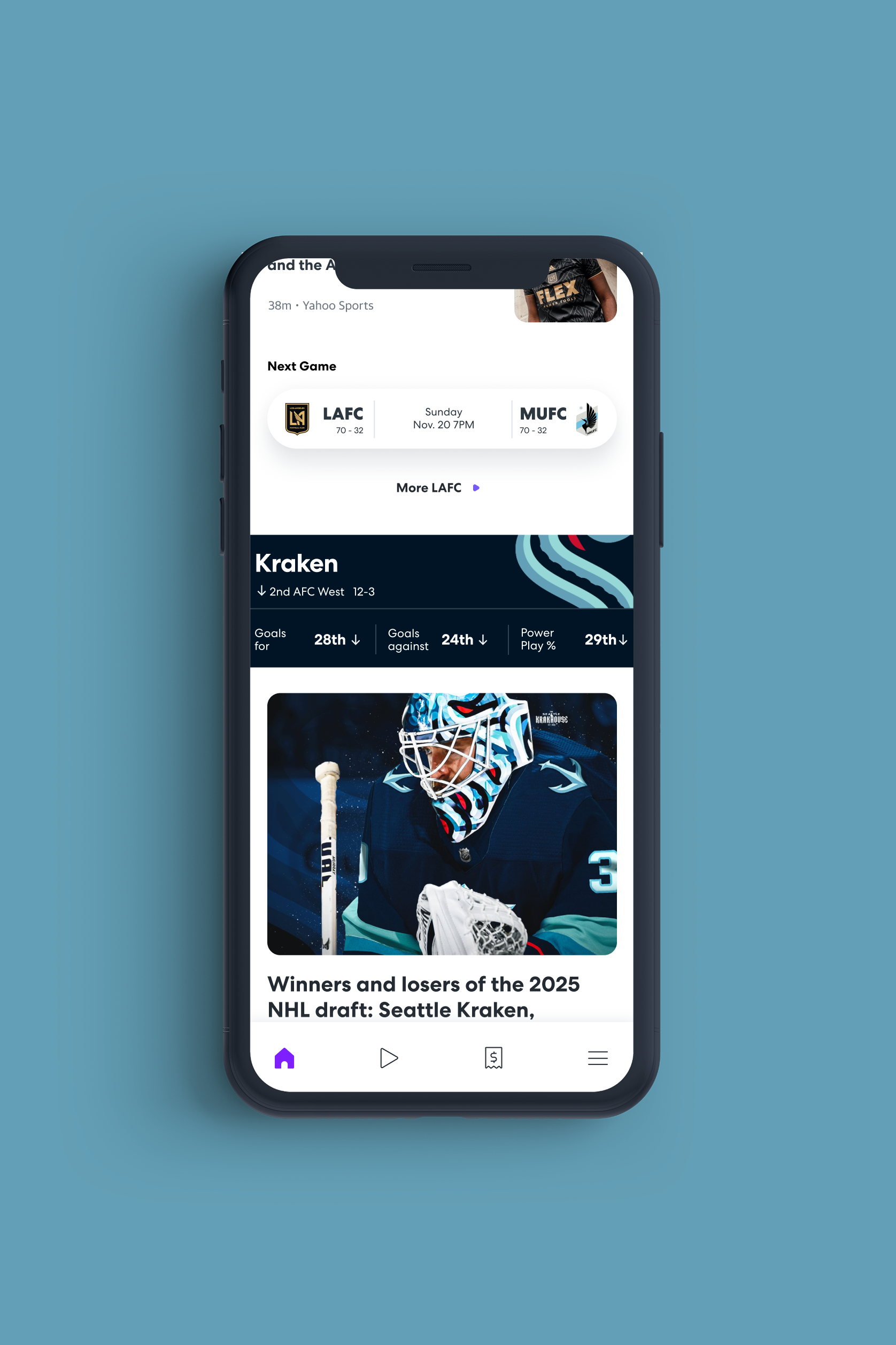
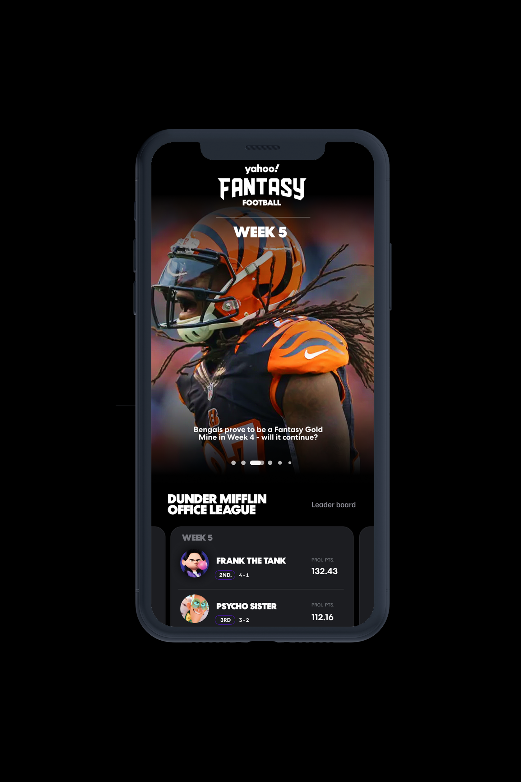
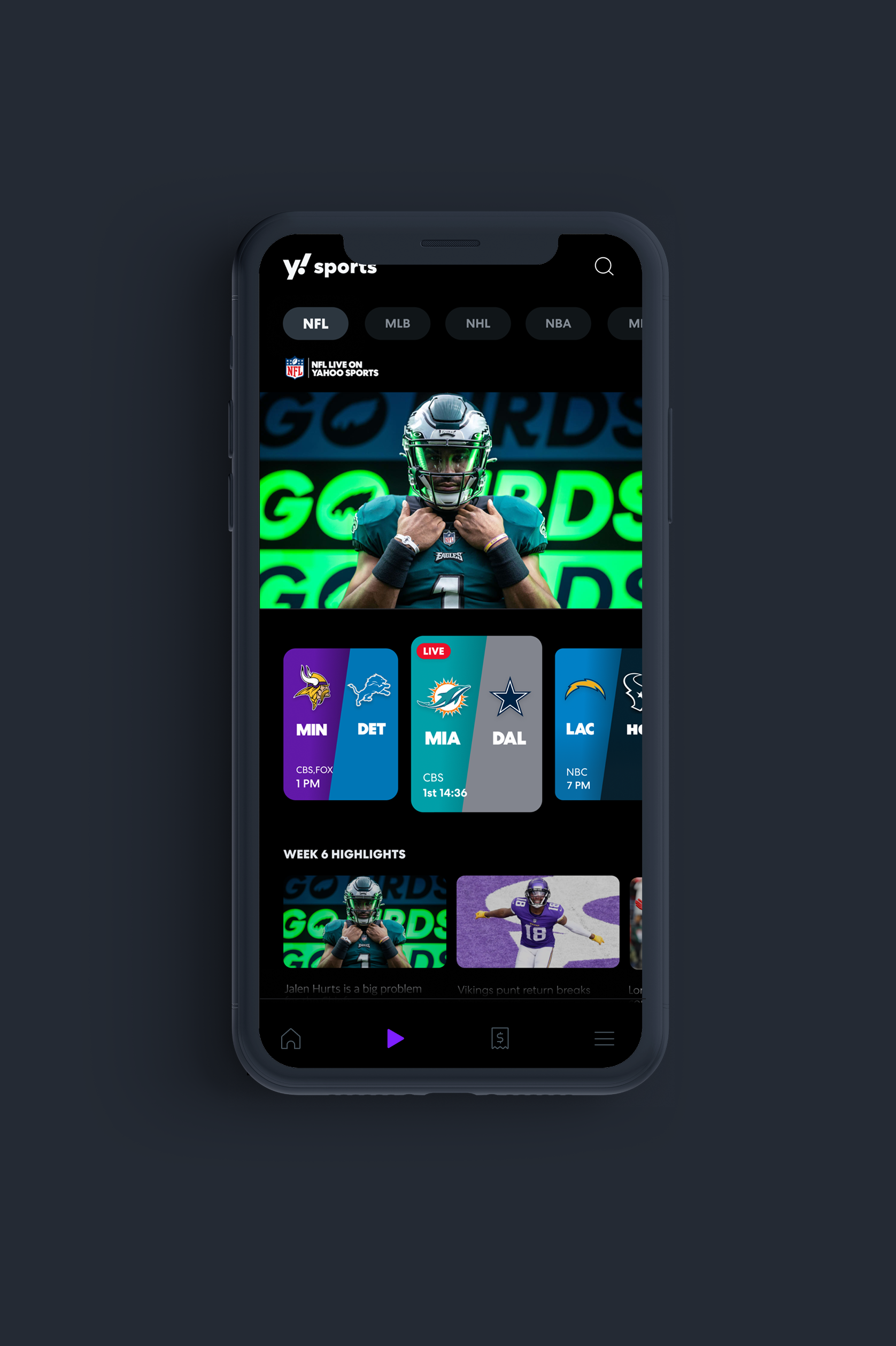
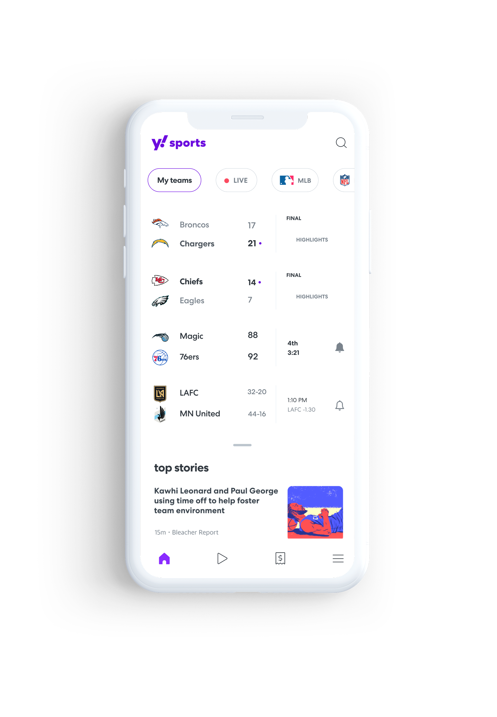
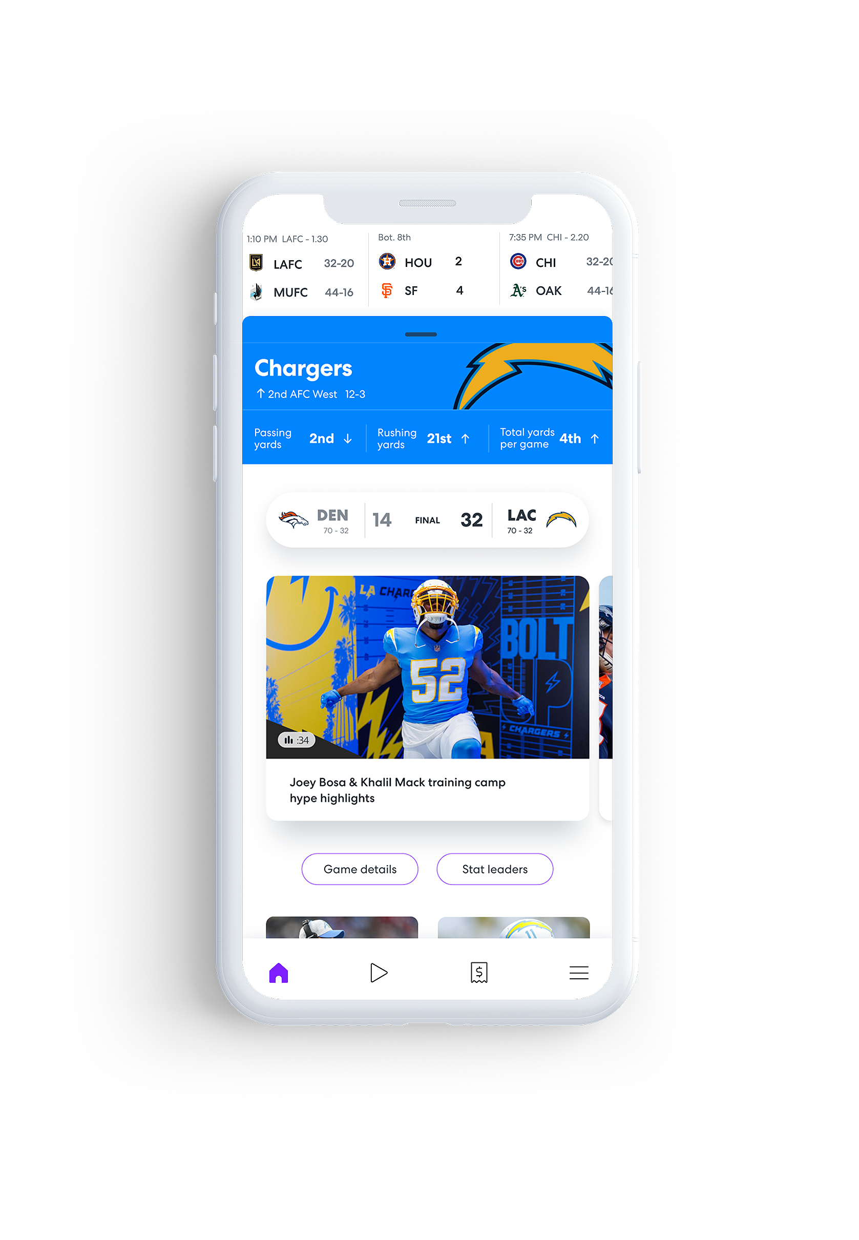
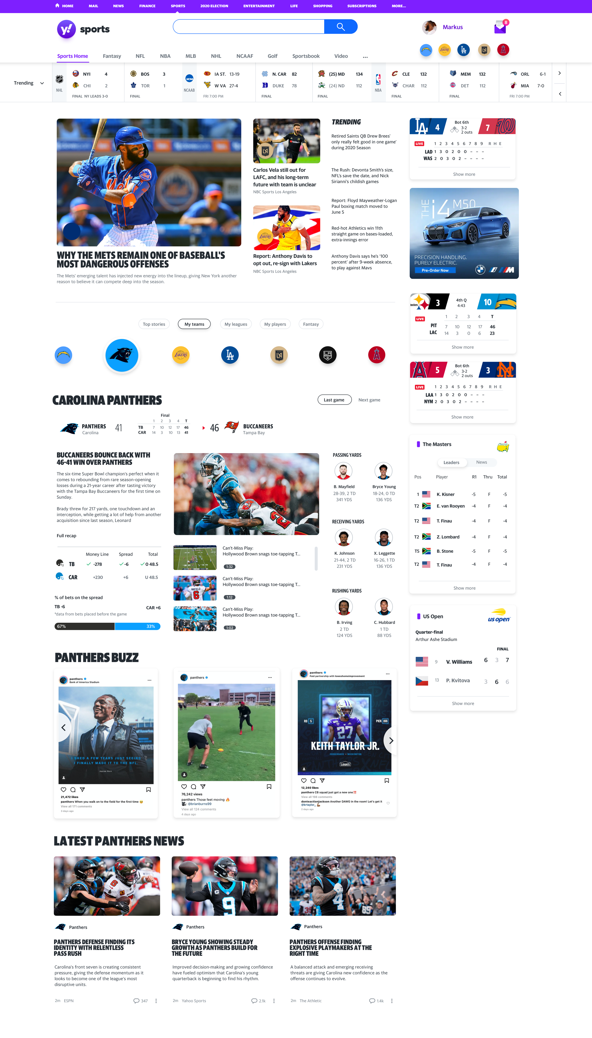
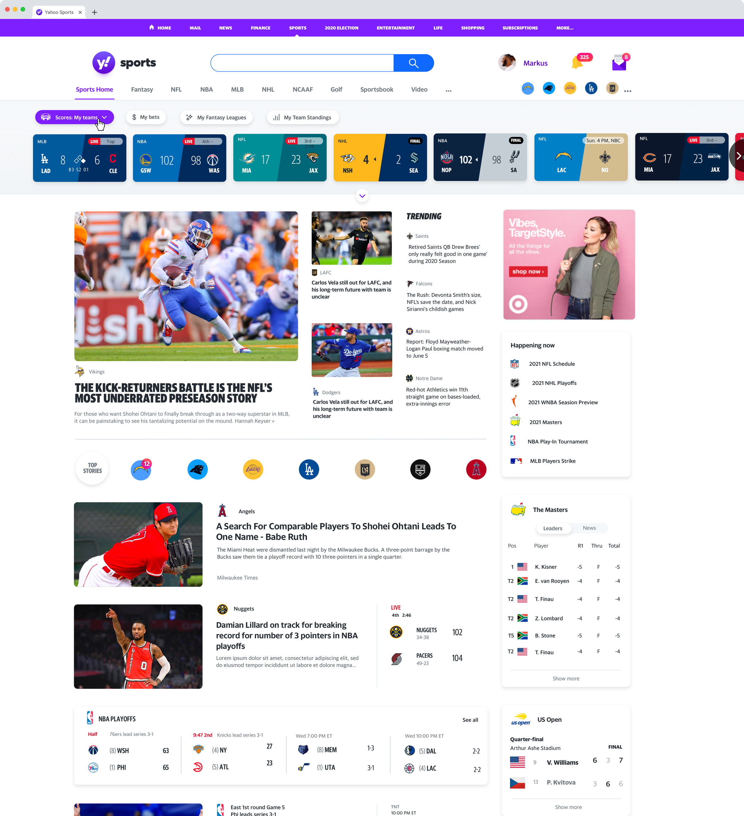
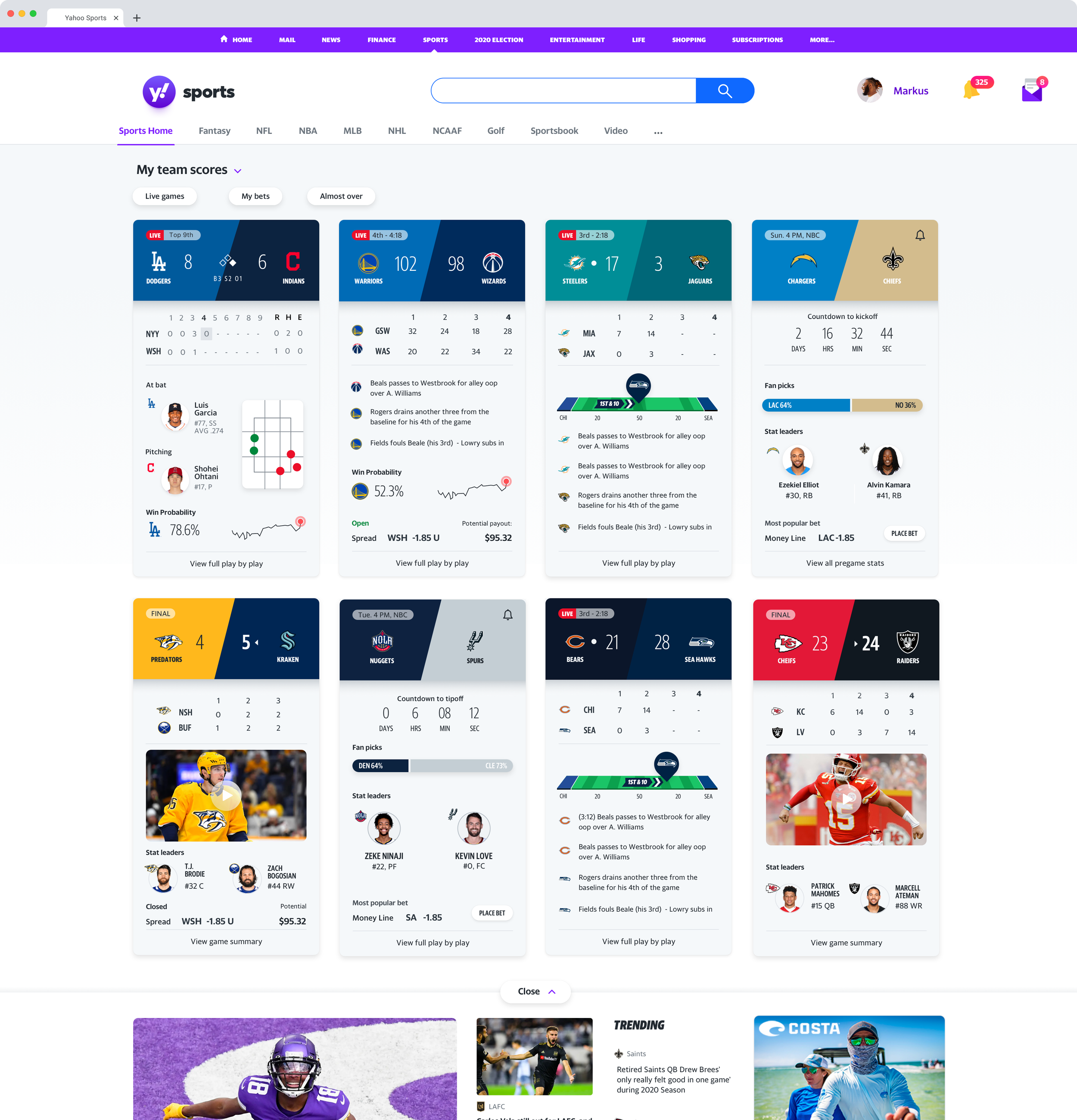
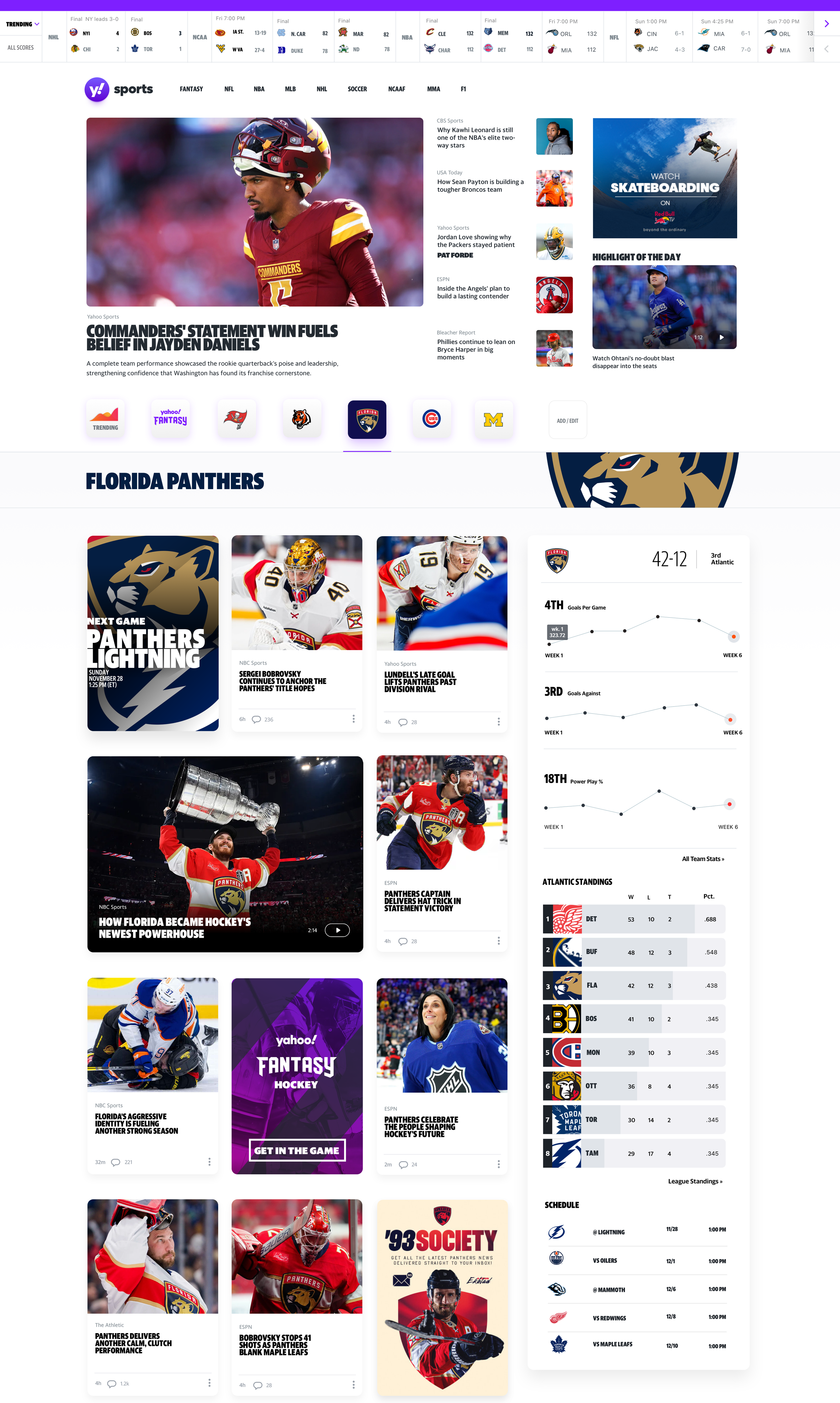
Sports
Sports fans don't always want the same thing. Sometimes they want the score. Sometimes they want the story. The challenge wasn't choosing between them—it was designing an experience that understood the difference.
News
Authority, credibility, information density
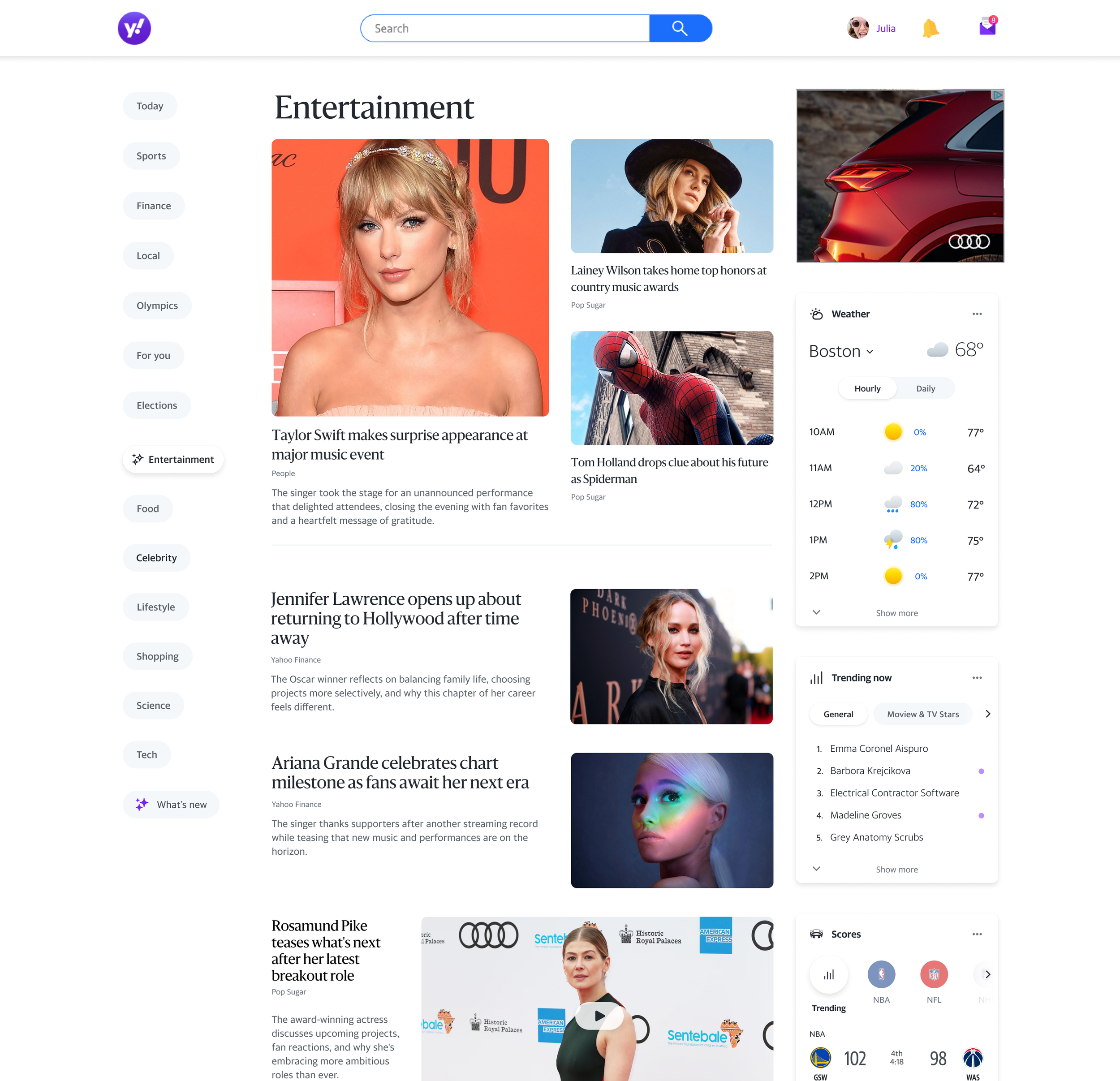
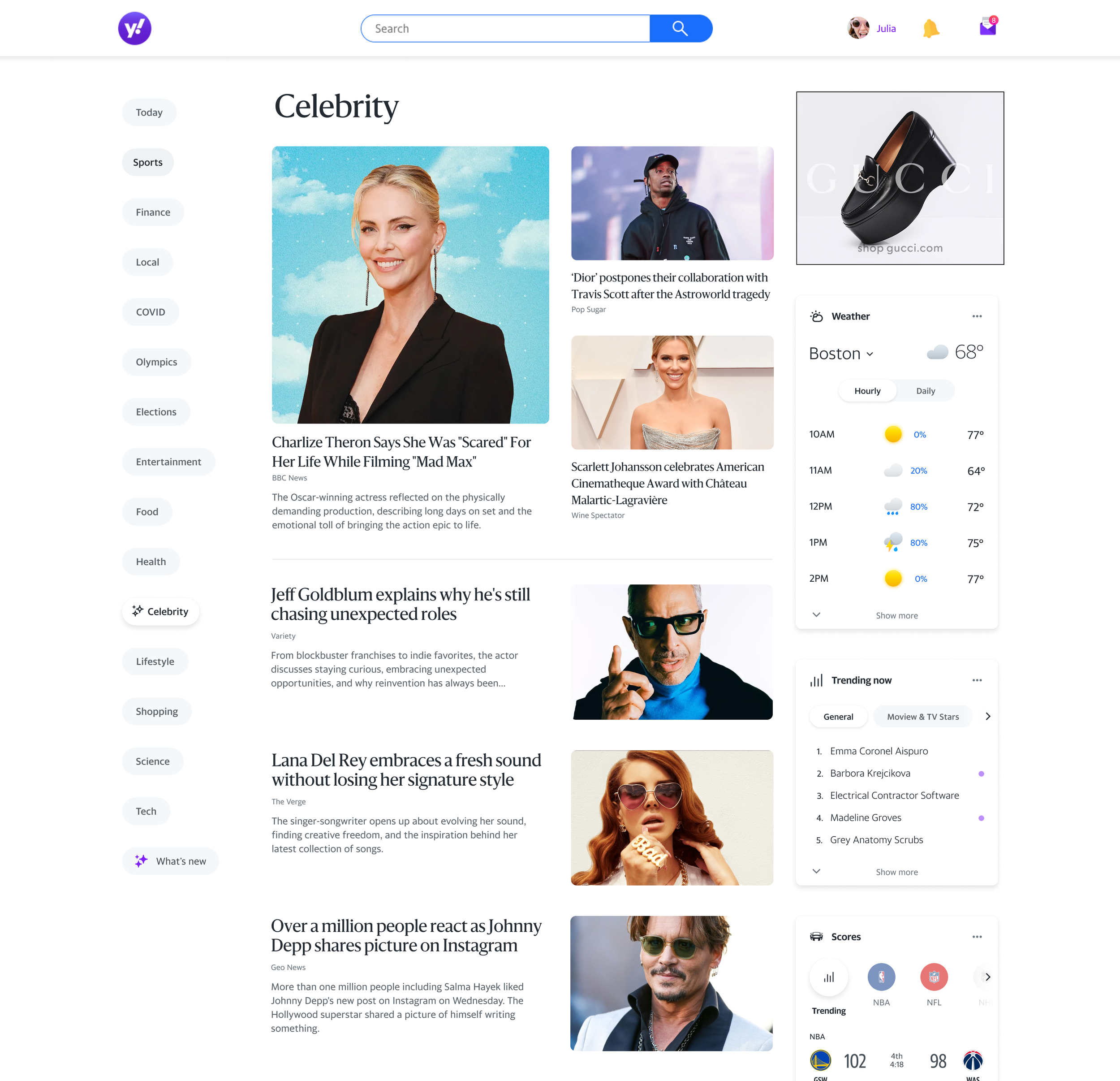
Lifestyle
Aspirational, editorial, browsable
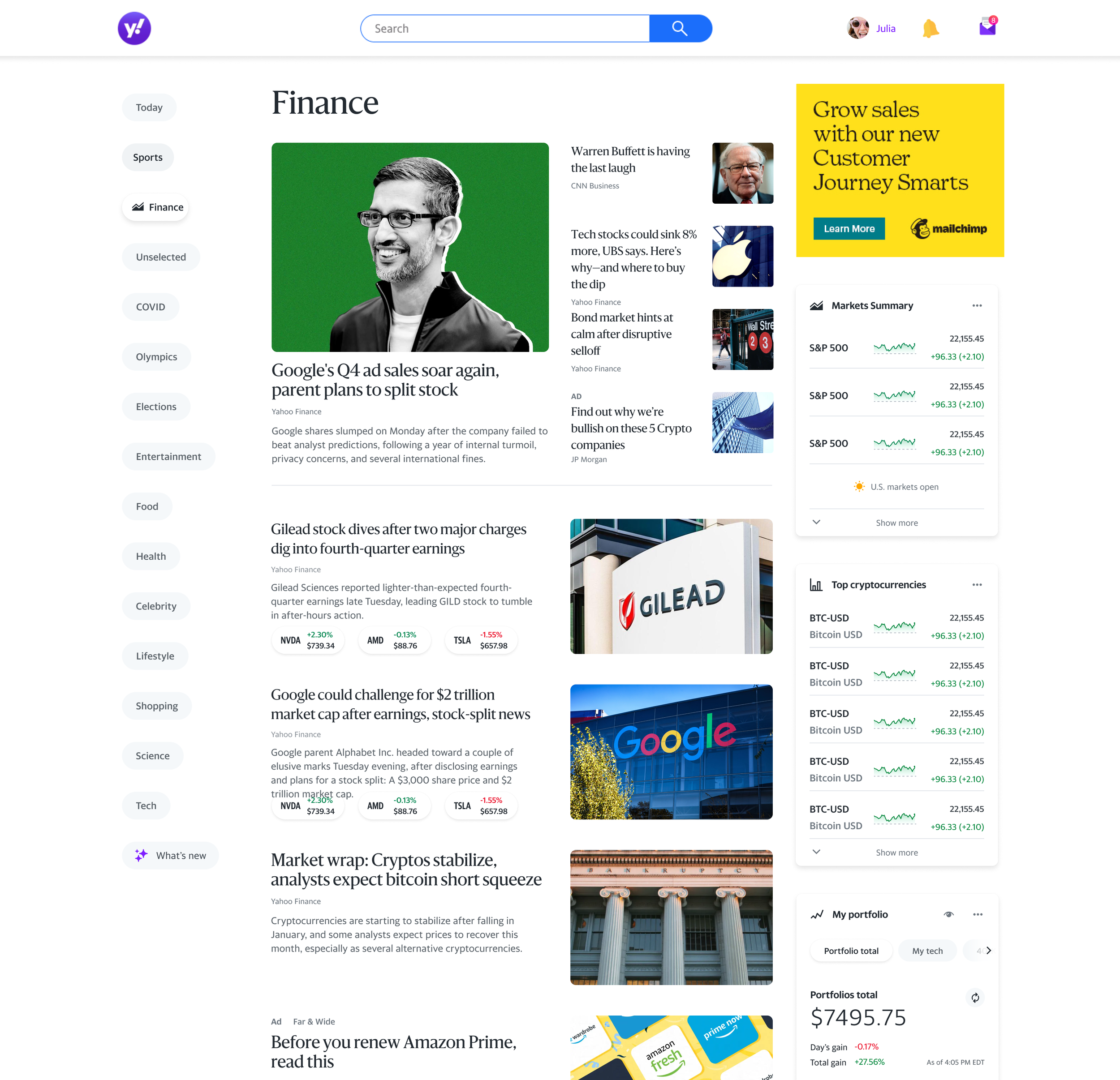
Finance
Trust, precision, data clarity
UX isn’t experienced as a collection of big decisions. It’s experienced as an accumulation of small ones.
Nobody walks away from a well-designed experience thinking about the precision of the margin, the weight of the dividing line, or the exact shade of a secondary color. And yet those decisions are doing more work than almost anything else in the system. They’re just doing it quietly.
The nature of small graphic choices. When they’re right, they’re invisible. When they’re wrong, something feels off and nobody can quite say why. That gap between cause and effect is where a lot of brand work quietly succeeds or fails, and it’s rarely where the loudest conversations in a design process happen.
The big decisions that get attention, The logo. The hero typeface. The primary color palette. These are the things that get represented, debated, signed off on. They matter. But a brand isn’t experienced as a collection of big decisions. It’s experienced as an accumulation of small ones. The way a headline sits above a body of text. The consistency of padding across every touch point. The micro-moments of a button state, and icon, a dividing rule that either feels considered or doesn’t.
Taken individually none of these are the point. Together they’re everything.
There’s a reason the brands that feel most complete are often the hardest to copy. It’s not the logo that’s difficult to replicate. It’s the density of small decisions behind it. The system thinking that determined how elements relate to each other at every scale, in every context, across every application. That level of craft doesn’t announce itself. It accumulates. And the accumulation is what produces the feeling of a brand that knows exactly what it is.
Most design processes don’t protect that layer of work adequately. The brief covers the big moves. The timeline compresses the finishing. The feedback loops focus on the visible and the obvious. The small decisions get made under pressure, inconsistently, by whoever happens to be touching that part of the project. The result is a brand that looks right from a distance starts to unravel the closer you get.
What an audience feels when they encounter a brand that’s been built this carefully is hard to articulate but immediately recognizable. It’s the difference between something that looks designed and something that feels considered. Between a brand that was made and a brand that was meant.
The small choices are where that meaning lives.
Lead story modules
News stream
Category modules
Type styles & weights
Illustration
Podcast and video art
Photography direction
Motion and on-air graphics
Editorial storytelling
Icons
Grid
Color system
Core typeface
Buttons
Interaction patterns